Menu
  • Home
  • About
    • Contact
  • Categories
    • Art
    • Fashion
    • News & Politics
    • Photography
    • Tech
      • Computers and Internet
      • Video Games
  • Twitter
  • Magpile

Stuff On Paper

Magazines (mostly), and why I like them (or don't).

Monrowe, Issue 1

Frequency at time of publication: Bi-annually
Editor-in-Chief/Publisher: Ricky Kim
Publisher: Jackie Linton
Creative Director: Lindsey Hornyak
Fashion Director: Priscilla Polley
Still published (as of this post)?: Yes

The last time I was at one of my local bookstores, I bought two fashion magazines I hadn’t come across before. They’re both great looking, well-produced mags, but opposite each other in their implied or implicitly stated underlying philosophies. I thought it would be fun (for me, anyway) if I reviewed the two back to back so you can compare and contrast. First let’s take a look at the recently-founded Monrowe; next time, the giant coffee table magazine Exhibition.

Monroe Magazine issue 1 cover

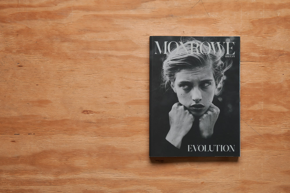
Monrowe is the result of a successful Kickstarter campaign by founder and publisher Ricky Kim. Through Monrowe, Kim seeks to “combine beauty and meaning” into a a one-stop shop for your thinking and emotional brains, where fashion and art are the vehicles for discussions of “psychology, social consciousness” and scholarly pursuits (Kim 11). An attractive idea, and certainly different than your typical fashion rag, discussing fashion for fashion’s sake (which is cool too, by the way).

This inaugural issue is based around “Evolution”, and the content sticks pretty well to the theme on multiple levels, from personal to global.

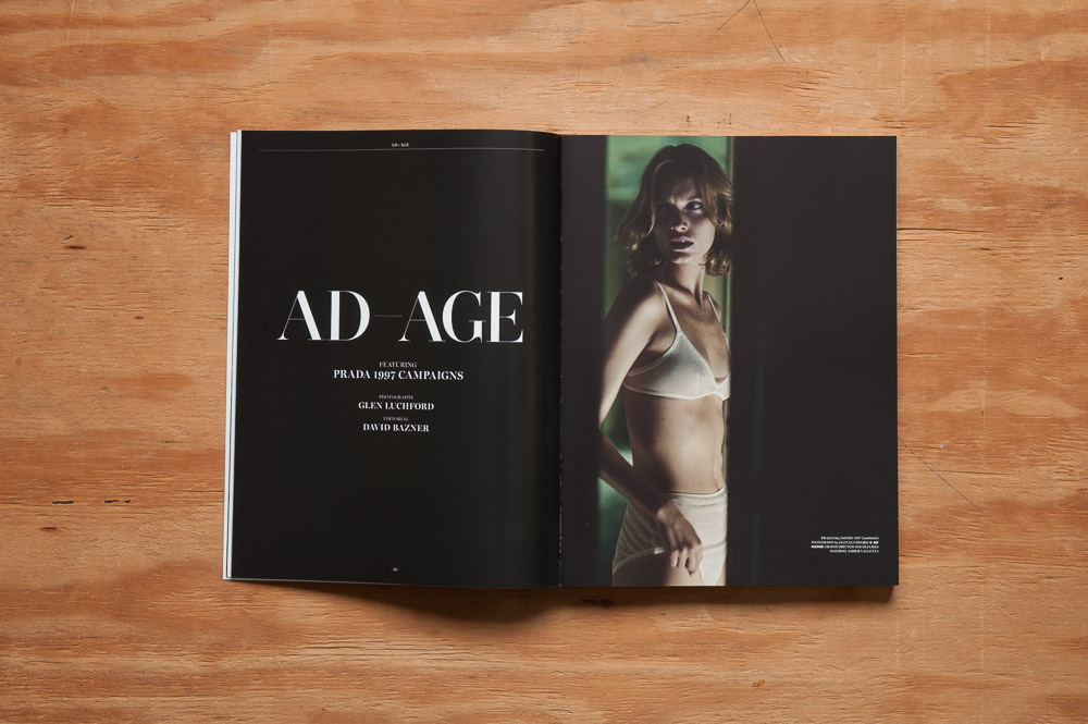
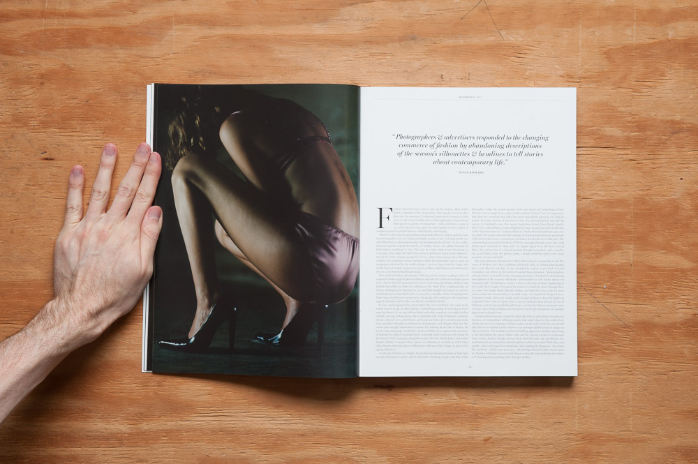
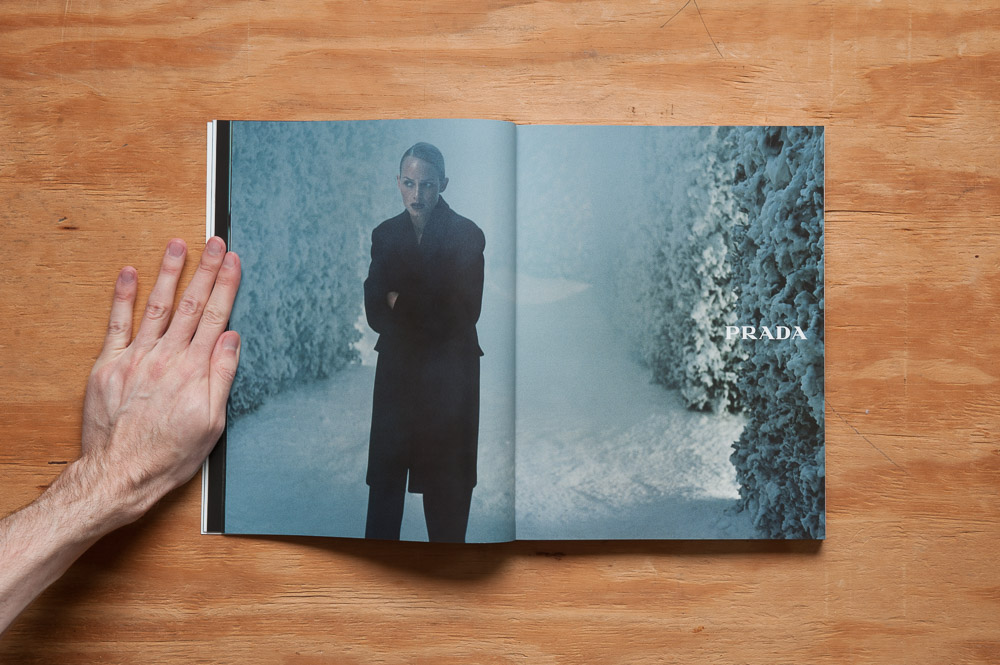
“Ad-Age” was particularly interesting in its examination of a brief history of fashion photography and its transformation from catalog-ey to story-telling art form. Along with the essay was presented Glen Luchford’s photography of Amber Valletta for Prada’s 1997 ad campaign, here as art, as part of the magazine’s content, and not something you flip past as you’re looking to get to the content. Cool to see. It’s also nice to see all these ads here in one place, which gives you an even better sense of the cinematic feel of the images, which the essay talks about. You can almost feel a narrative forming.

Monroe Magazine Ad-Age opening spread

Monroe Magazine Ad-Age spread

Monroe Magazine Ad-Age spread

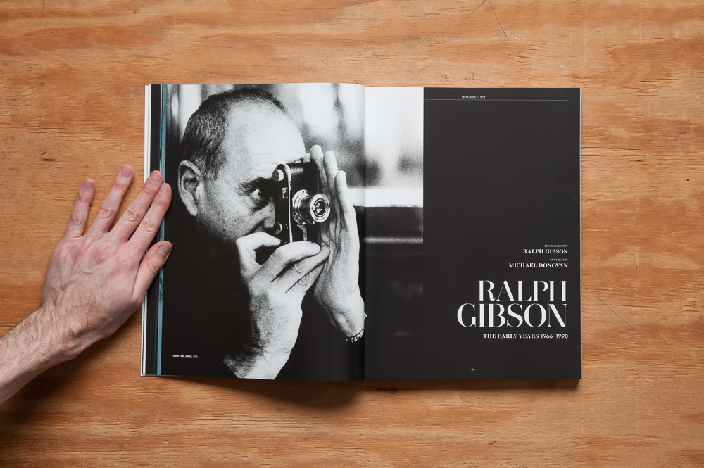
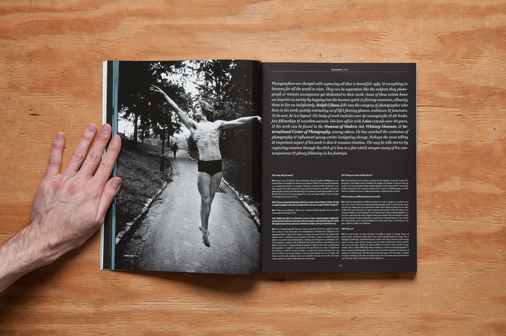
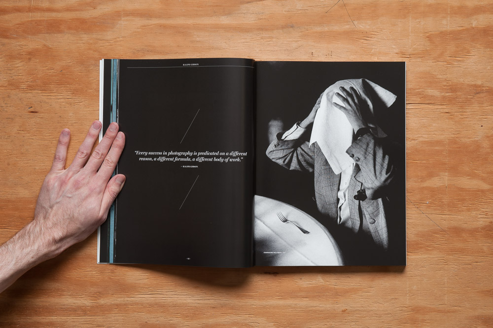
The best interview—and by “best” I possibly do mean “best” but definitely mean “my favorite” simply because I love his photography—is with Ralph Gibson. Some of what was said here I’ve heard before in his book Deus Ex Machina, but reading his thoughts from digital photography to getting out of your comfort zone to photography as a tool for introspection was an insightful treat.

Monroe Magazine Ralph Gibson interview opening spread

Monroe Magazine Ralph Gibson interview spread

Monroe Magazine Ralph Gibson interview spread

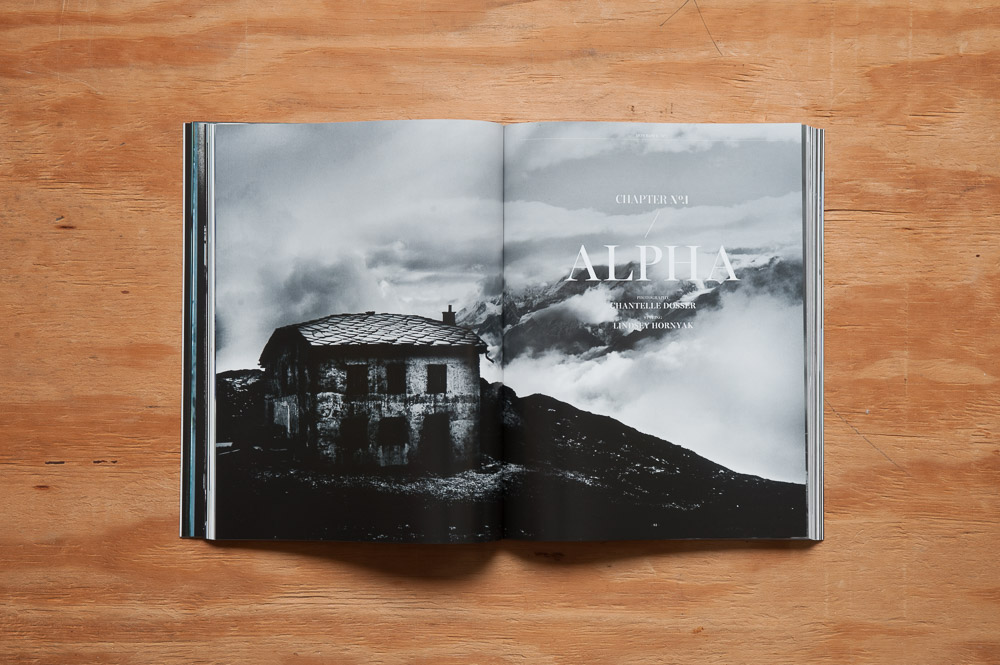
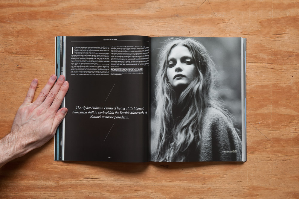
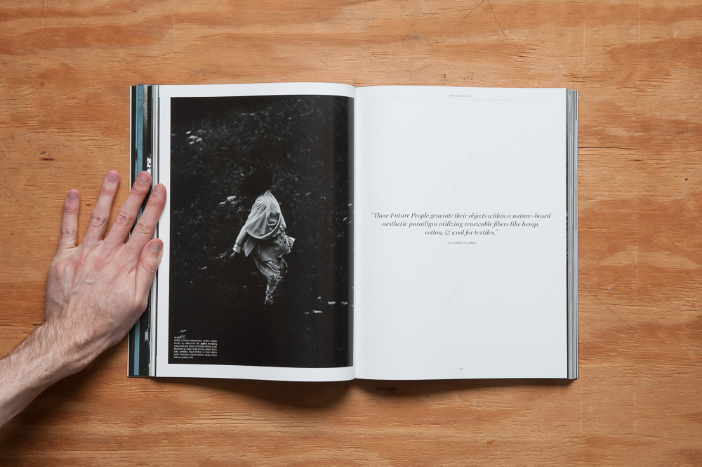
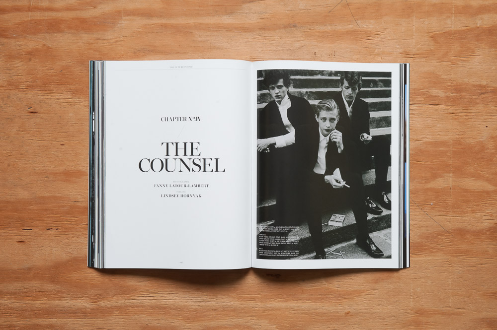
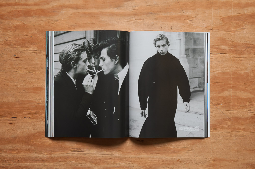
The crown jewel of the issue is the feature fashion editorial called “The Future People”, which is actually a collection of four editorials (covering a whopping 90 pages of the 224 page mag). It starts with one question: how will the world change forty years from now? From that, how will the people be different? And finally, how will the clothing they wear and their attitudes towards it be different? After a brief discussion of the Earth of the future, the editorials are divided by groups of people, representing four different possible scenarios, with a short essay preceding each which attempts to answer these questions. For example, the first group is called the Alpha. They “live close to the land, connected to the pulse of the earth”, and they “promote the use of natural, sustainable fibers and color-free dye” (Goblé 82). More detail is delved into regarding each group’s culture and beliefs, and makes for an interesting combination of what-if scenario, fashion photography, and social advocacy.

Monroe Magazine The Alpha opening spread

Monroe Magazine The Alpha spread

Monroe Magazine The Alpha spread

Here’s some spreads from scenario number 4, “The Counsel”.

Monroe Magazine The Counsel opening spread

Monroe Magazine The Counsel spread

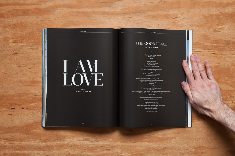
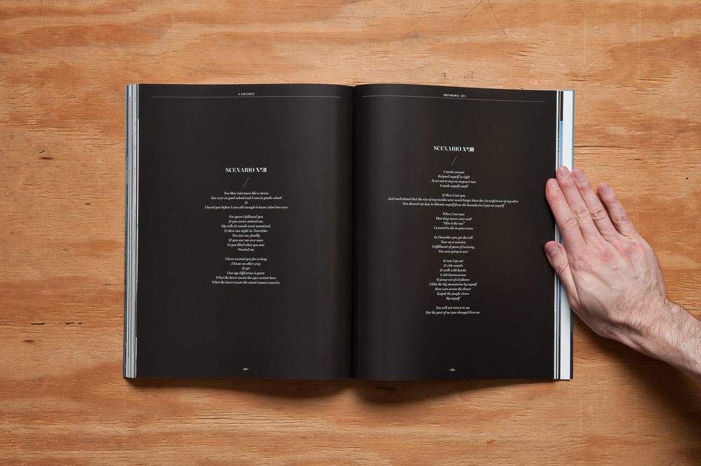
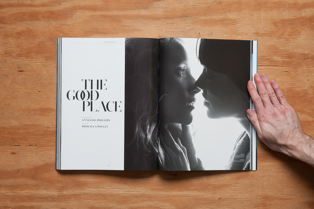
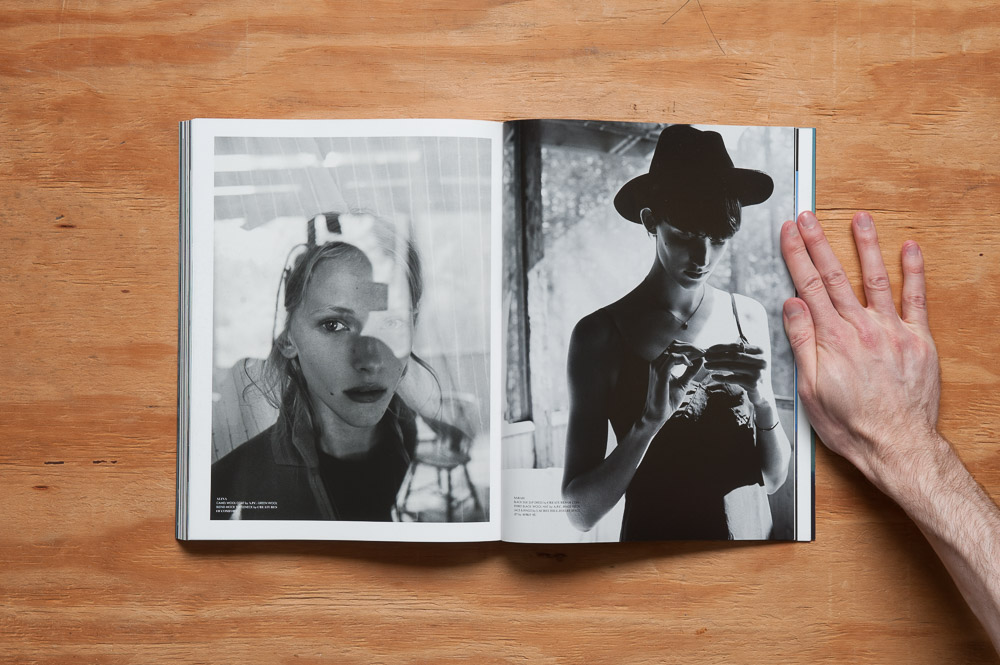
Another good example of “combining beauty and meaning” is with the poetry and editorial both titled “The Good Place”. (Or I guess it’s titled “I Am Love”, and subtitled “The Good Place”?) Either way, it’s clear that it was meant to “go” with the editorial that follows. While the poetry doesn’t explicitly describe what may or may not be going on in the editorial (which I think is a good thing), after having read it, you can’t help but think of a sort of implied narrative or backstory as you’re viewing the images. It made me look at them differently, a little more deeply. I liked that.

Monroe Magazine I Am Love / The Good Place poetry spread

Monroe Magazine I Am Love / The Good Place poetry spread

Monroe Magazine The Good Place opening spread

Monroe Magazine The Good Place spread

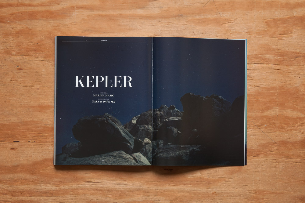
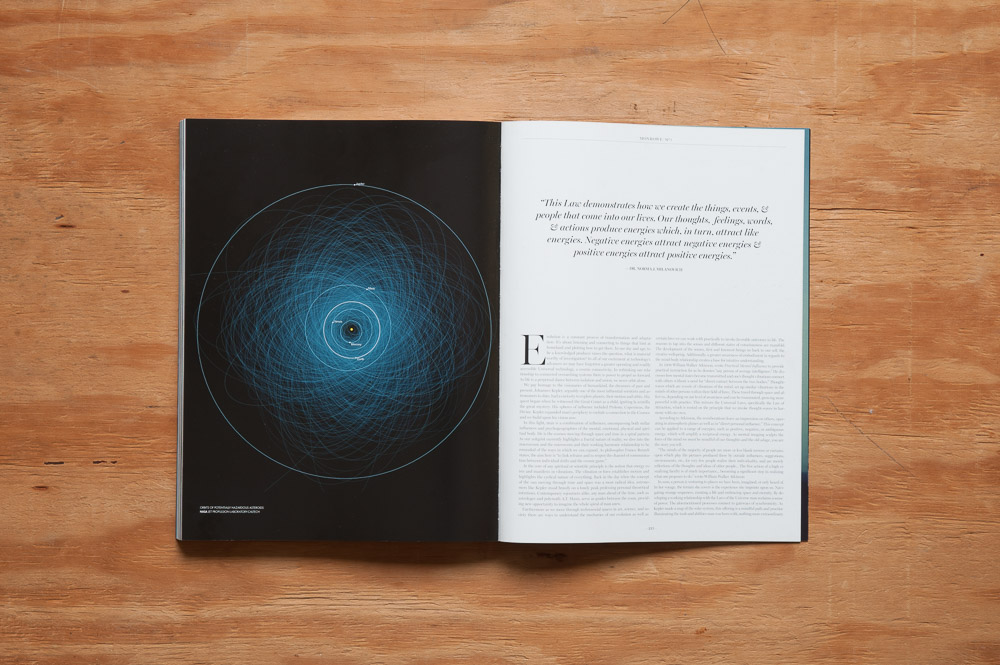
The only thing I’d consider a let-down on an otherwise great first issue is the essay “Kepler” by Marina Masic. The first time I read it was one of those experiences where you’re pretty sure you just read sentences, but you have no idea what you read. Sometimes that happens with complex topics—I’m but a simple man, after all—so I read it a few more times. As best as I can understand, the essay (or at least part of it) can be summed up by one phrase: “You get what you give.” Think positively or negatively, and good or bad things will come back to you, respectively. And I agree with that on a practical level. If you’re thinking positively about a project, for example, you may be more likely to get that project done. But Masic tries to explain this scientifically. “At the core of any spiritual or scientific principle is the notion that energy exists and manifests in vibrations” (Masic 215). Well, according to the kinetic theory of matter, all things are composed of molecules that are in constant motion, so, okay. I wasn’t sure what she was getting at in regards to spirituality, though. Reading on, she explains that thought-waves are “vessels of vibrations of the mind” and can influence “vibrations in the minds of other persons within their field of force,” and that these “reverberations leave an impression on others, operating in atmospheric planes as well as in ‘direct personal influence’” (Masic 215). I think my own thought-waves are making my head hurt just from reading this again. A person’s mood influencing someone to a degree, sure, I could see that, but this pseudo-science Masic is selling, I ain’t buying. It doesn’t help matters that she quotes Dr. Norma J. Milanovich, a “messenger for the Ascended Masters regarding Earth’s transition into the Fifth Dimension” above the main body of the article, which you can see in the second picture below. (Go right ahead and believe what you want, but if the highly-intelligent Arcturian alien race really does exist that Milanovich talks about in her books and elsewhere, I don’t think they’d bother sharing their knowledge with us humans. They probably did build the Pyramids though. Just sayin’.)

Monroe Magazine Kepler opening spread

Monroe Magazine Kepler spread

I went on about that last essay way too long, but suffice it to say, the essays and interviews in Monrowe range from the great to the so-so all the way to the WTF (thankfully that was just “Kepler”). There were some small issues, like some typos or keeping essays more on track at times, but I would overlook all this for a first issue. Putting a magazine together, especially one of this size, scope, and for the first time, is a massive undertaking, and hey, it’s not like we haven’t let mistakes slip through in L’Allure des Mots, either.

And I haven’t even mentioned the production quality and design yet! To keep this review from going that much past one thousand words, I’ll just say the design is attractive, the paper is a nice thick coated stock, and the cover has a silky matte lamination with metallic debossed lettering. It’s pretty!

I’m excited for the possibilities with Monrowe, and I’ll be looking for the next issue. Take a look at this one if you haven’t already and support this fledgling publication. There’s more positive than negative here. I absolutely appreciate what Monrowe is trying to do, just next time, I hope they keep the “science” out of it.

Monroe Magazine issue 1 back cover

EDIT: Monrowe put up some of this issue’s essays, interviews and editorials on their website after this post was written (including “Kepler“). Go check ‘em out.


References
Kim, Ricky. Letter. Monrowe. Issue no.1. January 2015: 11. Print.
Goblé, Kat Höelck. Monrowe. Issue no. 1. January 2015: 82. Print.
Masic, Marina. Monrowe. Issue no. 1. January 2015: 215. Print.
Sunday, June 14, 2015 stuffonpaper Permalink Leave a response Fashion, Photography, Monrowe

Power Trippin’ Down Memory Lane: A Look Back at the First Issue of Nintendo Power, Part 3

This is the final part of my look back at the first issue of Nintendo Power. Here’s part 1 and part 2, and the pdf of the first issue [via Eoin Stanley].
***

Super Mario Bros. 2! Zelda’s Second Quest! Double Dragon! Gauntlet! Contra!

Billy kicking Williams, Nintendo Power, Issue 1

I’m lumping all these big game features together under the category of “gaming porn”. I can’t remember my exact reactions, but I know me, and I’m sure when I saw these features—even the ones for games I already had—that I was overwhelmed to the point of hysterics. Look at all the bright colors! Look at all the maps! Look at all the things you can do! Look at all the hints, tips, and tricks! Look look LOOOOK!!! 

For me, these big feature feasts-for-the-eyes were like the fashion editorials in Vogue (not that I bought Vogue back then, but bear with me). They’re what I flipped through first before getting to the meat of the issue’s content, i.e. Classified Information.

Yeah, they gave you some rudimentary tips, advice, and “insider info”, but that was a secondary function. I mean it wouldn’t be too hard to figure out that if you press the B button, Billy will kick. (Okay okay, maybe the Zelda guide could be useful, if and when I decide to play through it a second time.) It’s not hard to see how strategy guides and walkthroughs in gaming mags as a whole took a hit once ad revenues began to slip and gaming journalism’s focus began to shift around 2003 or so. The main function of these big eye-catching features, of course, was to get you amped to buy those games (thanks Mom and Dad! ^_^). They were the “close” in the sales brochure that was the entire issue.

But you know what? At nine years old none of that mattered. In the case of Super Mario Bros. 2, NP was sharing everything from where the secret rooms were down to the smallest of details, e.g. Luigi’s high-jumping talents, before anyone else would know about it. That was huge!

Advertorials or no, I still love these features. I get a kick flipping through them to this day (just like old fashion editorials!). And as busy as these layouts might be, I’m certain they—the entirety of all the gaming mags I read, really—planted the seeds for my future love of graphic design.
***

Video Spotlight

From Video Spotlight, Nintendo Power, Issue 1

As an adult looking back on how obsessed we kid gamers were back then with our games, Video Spotlight is now one of my favorite sections in this magazine. It highlighted the best, most dedicated gamers around, as suggested by others, or even themselves.

And hey, I’m not judging. If I were able to beat Super Mario with “160 extra men with over 1,100,000 points without time warp,” and do it in “10 minutes and 23 seconds” like Trey did, I’d want people to know about it too.

Here we see what true dedication is…

“['Ace Ebb']‘s hobbies are playing Nintendo games, period. He has no pets, instead he plays Nintendo all day!”

…the meaning of loyalty…

“[Kevin] says he’s played Sega, one of your rivals around here, but said, ‘Sega doesn’t come close to Nintendo.’ One reason for this is because Nintendo gets all the arcade hits. The phrase, ‘Now You Are Playing With Power,’ is very true to him.”

…and advice that’s just as relevant for gaming as it is for life:

“…You’ve got to know how to land.

“…Have a lot of health.”

“…Get plenty of men.”

(That last bit of advice may only be relevant for some of us, but at least it’s still there if we need it.)

We also learn the difference between cockiness and confidence can be as simple as a set of parentheses:

“I don’t think (I’m not sure) that there is a better player at Super Mario Bros. than I am.”

Besides just being a sounding box for how good these guys were, Video Spotlight also gave us just the tiniest of glimpses into their lives:

“Mike lives in a family of four. He has a cat named Kitty.”

“HOBBIES: Trampoline jumping, and solving his and his friends’ Nintendo games.”

“PETS: One and a half cats, Suki and Muffin. (Muffin is half mad)”

“OTHER INTERESTS: To become a dentist and to become a Nintendo Game Counselor.”

And finally:

“GOAL: To solve every existing Nintendo game.”

At 36, that’s still my goal today.

We may have gone on to be dentists, but we we’ll always be gamers.
***

Editor’s Letter

Howard Phillips' editor's letter, Nintendo Power, Issue 1

In its entirety, Howard Phillips’ editor’s letter:

“Dear Player,

We hope you enjoyed reading the first issue of Nintendo Power as much as we enjoyed making it. We spent many hours doing research (playing games) in order to bring you the most complete reviews, the best tricks, and the raddest reading ever! I even jetted to Japan for a week to work with our Nintendo Power staff over there. You try to explain Wheel of Fortune to someone who doesn’t speak English! It was great to make new friends and to meet some pretty hot game players too! Maybe we’ll even profile a few of them in a future issue.

Nintendo Power will come out every other month, and we want to provide you the very best in video journalism (We’ve discontinued the Fun Club News, so that we can devote all our energy to making Nintendo Power the best magazine you could ever subscribe to). What could be more fun? So, if you have an opinion about something, or a hot tip you want to share, we’d like to hear about it.

See you in September,

[signed] Howard Phillips

P.S. I’m working real hard on Zelda II. Look for it. It’s going to be great!”

Howard, Gail Tilden, Pam Sather, Minoru Arakawa, and all those who made Nintendo Power possible, thank you. You helped make my childhood awesome.

Monday, June 8, 2015 stuffonpaper Permalink Leave a response Video Games, Nintendo, Nintendo Power

Power Trippin’ Down Memory Lane: A Look Back at the First Issue of Nintendo Power, Part 2

Last time I went into a little history about myself and what made Nintendo Power so special to me.  Now let’s get into the magazine itself (download this pdf of the first issue [via Eoin Stanley] if you haven’t already to follow along).
***

Opening Spread

Nintendo Power Issue 1 opening spread 1

The first spread brings up something I know a lot of us young gamers did back then, whether you want to admit it or not—calling up a game tips hotline. Also note how the cover of the mag the girl is holding is different than the final version. I guess they hadn’t done the final clay sculptures by then.
***

On the second page

“Nintendo Power is created by video game experts for video game enthusiasts…”

Wait, was being a video game expert a job? That people did? And people PAY you? Little Sam just discovered what he wanted to be when he grew up.

Actually… do you remember those business card vending machines that popped up in the 90s? Kind of like this one but not as fancy (and not as Japanese). There was one in a mall near me, so a friend and I, of course, had to get some to show everyone how good at gaming we were. I remember exactly what it said. Straight to the point:


Sam and [name of friend I’m not going to embarrass]

Gamepros


We were so cool back then.
***

Contents

Super Mario Bros. 2! Zelda’s Second Quest! Double Dragon! Gauntlet! Contra!

I’ll get back to these in part 3. For now let’s head over to…
***

Counselors’ Corner

Nintendo Power Issue 1 Counselors' Corner

Counselors’ Corner is one of those columns that I’m glad it was there, but I hardly ever used it, either because I didn’t have the games they talked about (which was the majority of the time), or because I already knew what they were discussing because I was just that good, dammit!

But now that I see this, I’m missing the hell out of my lost copies of Rygar and Mike Tyson’s Punch-Out!!.
***

Howard & Nester

Nintendo Power Issue 1 Howard & Nester

The Howard & Nester comic strips I didn’t really read at the time. I just glossed over the pictures and moved on. I know; sacrilege! Apparently enough people loved these that they stuck around a while, though. (You can find every single Howard & Nester strip scanned right here, except the last one that’ll hit you right in the feels, which is here). Comics weren’t really my thing until my late high school and early college days, if I remember correctly (one of the aforementioned obsessions in Part 1). I still love comics now, and I appreciate these strips much more now than I did then. I was also ambivalent to the Zelda strip that came later based on A Link to the Past, but now, I’m looking forward to picking up the recently re-released collection.
***

Classified Information

Nintendo Power Issue 1 Classified Information

Two words: Konami Code.

Guys. Guys. This is a big deal.

Though the now legendary code was first used on Gradius released in 1986, Contra (released a year later) is the game it’s discussed in reference to here, and the game that I most associate it with (and probably the first game I ever used it on). It’s quite possible this is the first place I ever even heard of the Konami Code.

Classified Information was “…the place where programmers and pros reveal top-secret quirks and ultra techniques. Read them. Practice them. And astound your friends with your on-screen hocus pocus and cool tricks.” Makes sense now that NP had the goods on game codes and cheats, since one of the agreements with licensees was Nintendo Power had first dibs on them. Classified Information was one of the first departments I flipped to in issues since.

“Have you found any hidden commands for “continue” or “invincibility” or anything else? If so, let us know!”

Finding a cheat no one had discovered yet and getting it published in Nintendo Power was a life goal for me back then. Alas, that never happened with NP. (But it did happen with GamePro! In the August, 1991 issue, to be exact. GamePro published a cheat I sent in for Gaiares for the Sega Genesis. This “cheat”, unbeknownst to me at the time, was already published in the manual—the manual that I obviously didn’t read—and apparently the GamePro editors didn’t realize it either. Oops. But my name’s still in the magazine, dangit!)
***

Baseball Round-Up

Nintendo Power Issue 1 Baseball Round-Up

What are your thoughts on baseball video games, 9-year-old Sam?

What are your thoughts on baseball video games, 36-year-old Sam?

I’m not be the biggest sports fan in the world (although I think I could get into some of these), but I did enjoy the odd sports video game back then. Heck, if a game was good enough, I’d check it out no matter what it was about. By the time I had this issue of NP I at least had Ice Hockey, and that game had countless hours put into it (great game to play with friends!).

But baseball games…

overall…

…Meh.

…Meh.
***

NES Journal

Nintendo Power Issue 1 NES Journal

It’s so weird to see Big Top Pee-Wee being talked about in the future tense!

Also, there’s Kirk Cameron.

Moving on…
***

Mail Box

Here I present this letter, verbatim, by Bill Harrington:

“The game Rygar has some of the best graphics Nintendo has ever used. Besides this, the music and character interaction in this game are superb. The music is very appealing to the player and does not make he/she bored after lengthy play. To give a better sense of action in the game, the characters are animalized and have special, unique ways of moving around. There is also a wide variety of creatures so you don’t get tired of the same ones over and over again. Another very good point to mention are teh different views in which Rygar, the main character, is shown. The two views used are the horizontal view, and the view of looking down from the helicopter. Usually a game has only one view of the character, but Rygar shows the intensity of combination. In conclusion, Rygar, to me, is one of the better graphic games put out for the NES and I would recommend it to anyone longing for action and adventure.”

Oh how I miss you Rygar!
***

Player’s Poll Contest

Nintendo Power Issue 1 Player's Poll Contest Page

One thing you have to say about Nintendo Power: they had awesome contests. The grand prize this issue? “The game library of your choice. That’s right, 10 hot titles all at once, now that’s playing with power!”

You bet your pre-dropped left testicle it is!

Heck, I would’ve been happy with one of the Nintendo Power jerseys. But alas, it wasn’t meant to be…


Next Monday: Video Spotlight, the Editor’s Letter, and those beautiful gaming features.

Sunday, May 31, 2015 stuffonpaper Permalink Leave a response Video Games, Nintendo, Nintendo Power
← Previous 1 … 3 4 5 6 Next →

Search

Copyright © 2025 Stuff On Paper.

Powered by WordPress and Cascade.