Menu
  • Home
  • About
    • Contact
  • Categories
    • Art
    • Fashion
    • News & Politics
    • Photography
    • Tech
      • Computers and Internet
      • Video Games
  • Twitter
  • Magpile

Stuff On Paper

Magazines (mostly), and why I like them (or don't).

Power Trippin’ Down Memory Lane: A Look Back at the First Issue of Nintendo Power, Part 1

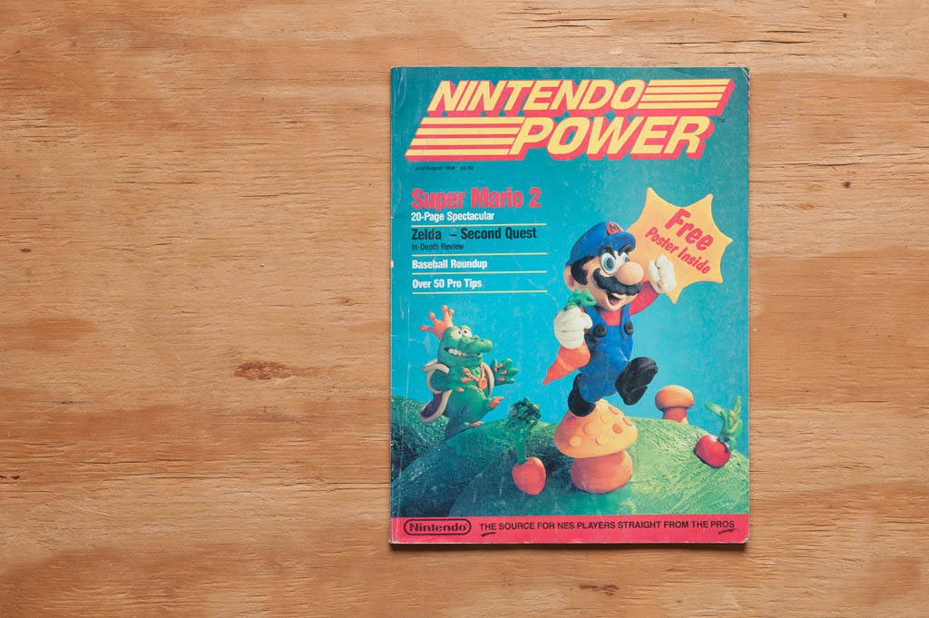
Nintendo Power, Issue 1

By the time my first Nintendo Power arrived in our mail box that summer in ’88, I was already nuts about Nintendo. The Nintendo Fun Club primed me to a degree—I was a card-carrying member, I’m proud to say—but even it couldn’t have prepared me for what I was about to hold in my sweaty little hands.

But let me back up just a bit.

My life is comprised of a series of obsessions. Some back-to-back, some overlapping, some calming down from “obsession” to “healthy interaction”, and some fading entirely, but anything I’ve ever been interested in more or less started out as “oh my gosh I’ve discovered this new amazing thing I must learn everything I can about this new amazing thing and conquer it completely omgggggggg”.

In sort-of order, here’s my life in one paragraph:

Spelling (I liked spelling big words a LOT when I was little). He-Man. Transformers. Teenage Mutant Ninja Turtles. Video games (NES). Comic books. Magic: The Gathering (and other early collectible card games). Guitar. Video games (Game Boy). Video games (Sega Genesis). 3D computer graphics design. Video games (Neo-Geo). Video games (Super Nintendo). Pen-and-paper roleplaying games. HTML. Movies. Buying stocks and mutual funds (yeah, not exactly like the others, but an obsession for a time none the less). Video games (PlayStation). Video games (Nintendo 64). Video games (Dreamcast). Video games (PlayStation 2). Video games (Xbox). Video games (GameCube). Video games (Xbox 360). Books. Photography. Comic books (again). Writing. Magazines. (The latest system I play now is a PlayStation 3, although I wouldn’t count that among the obsessions.)

You can probably see a pattern here. Video games, above all things I obsessed over, was the obsession. Only very recently, I’d say in the past 8-10 of my as-of-now 36 years, have I not obsessed over video games like I had throughout most of my life. Make no mistake—they’re still very much a part of my life. They’ve just cooled down to the aforementioned status of “healthy interaction”. Maybe a tick above that depending on the day I’m having (“mildly consuming but still perfectly under control srsly”).

So what is it about them that’s kept them in my life for so long? I’d always liked stories. I’d always liked “pretend” (except for a very brief stint in my teenage years when pretend was dumb, only little kids did that). But nothing immersed you in their stories and their worlds like video games did, at least not for me, a young’un of nine years old, such as I was when the first issue of NP was released. A video game was a movie, a story book, and an action figure you took control of, which when combined, formed a kind of mental crack juice that I just couldn’t get enough of. Beating my latest game was the best feeling in the world. And the only way to get that feeling again was to get—and beat—another game.

Hi I’m Sam. I’m nine years old. And I’m addicted to Nintendo.

And I quickly discovered the next best thing to playing games was reading about them. When that first issue of Nintendo Power came in the mail, I tore into it with abandon (figuratively, of course—I handled that thing like it was the Bible).

I’ll be coming at this from a perspective of nostalgia, so don’t expect a review here. This is all about what Nintendo Power, Nintendo, and gaming in general meant to me then, and how I see them now.

Go ahead and download this pdf of the first issue of Nintendo Power [via Eoin Stanley] so you can follow along. Now that we’ve gotten a little personal history out of the way, in part two of this trip down memory lane (with a new part out every Monday until it’s finished), we’ll dive right into the magazine itself.
Monday, May 25, 2015 stuffonpaper Permalink Leave a response Video Games, Nintendo, Nintendo Power

Can we just talk about these W Magazine fashion editorials for a minute?

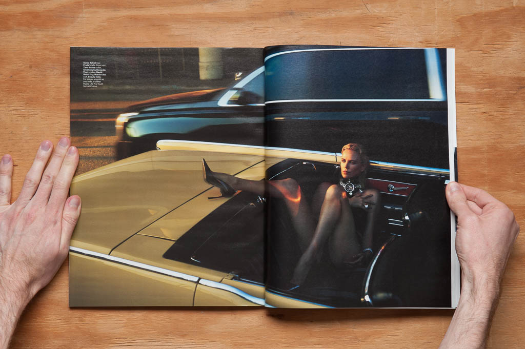
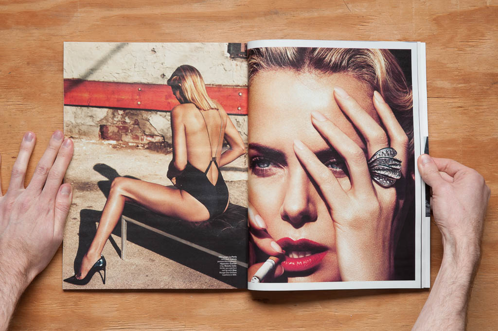
There are two awesome editorials in this month’s issue of W Magazine, one with Charlize Theron by Mert Alas and Marcus Piggott, and the other with Kate Moss by Craig McDean.

I love the styling by Edward Enninful in Mert and Marcus’s story…

W Magazine, May 2015-9603-2

Charlize Theron by Mert Alas and Marcus Piggott,, W Magazine, May 2015

…and how McDean framed his images of Kate is a little unconventional (except for the lips) for a mainstream fashion rag, which is nice to see. I dig tight crops that cut the images up in unexpected ways, especially as with the second to last image.

Kate Moss by Craig McDean, W Magazine, May 2015

Kate Moss by Craig McDean, W Magazine, May 2015

The full stories are on W‘s website (Charlize here and Kate here), but of course they look best in print.

Friday, May 22, 2015 stuffonpaper Permalink Leave a response Can we just talk about this for a minute?, Fashion, Photography, Charlize Theron, Craig McDean, Fashion, Kate Moss, Mert and Marcus, W Magazine

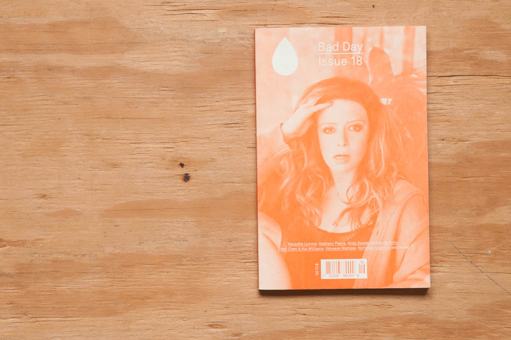
Bad Day, Issue 18

Frequency at time of publication: Bi-annually
Editor-in-Chief: Eva Michon
Publisher: Jackie Linton
Creative Director: Colin Bergh
Fashion Director: Avena Gallagher
Still published (as of this post?): Yes

Bad Day issue 18 cover

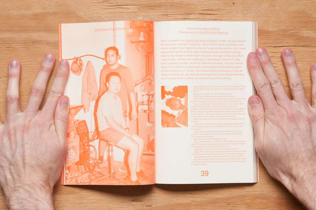
Bad Day  is a little hidden gem of a magazine. (Hidden to me anyway, in that I discovered it for the first time about a month ago.) At 6 x 9 inches and printed with one color over a majority of the issue, BD feels less like an arts and fashion magazine distributed world-wide and more like a zine made on someone’s color copier at home. And I mean that in the best possible way. The spot color printing and the small size of the magazine was, for me, what made it stand out amongst the larger full-color magazines that surrounded it on the stand.

Bad Day issue 18

That whole zine vibe makes sense too, as that’s how BD first came to be—as a small 50-copy project by Eva Michon and Colin Bergh. That was about seven years ago, and I’m glad that personal, tactile feel hasn’t changed after all this time.

While we’re on the subject of BD’s looks… the design is super simple in that it looks to be completely set in one typeface. The headings, body copy, pull quotes, all of it. Combined with the restriction to one color throughout most of the issue, this is one of the most minimalistic magazine designs I’ve seen. And remember, “minimalist” does not equal “boring”. I love it.

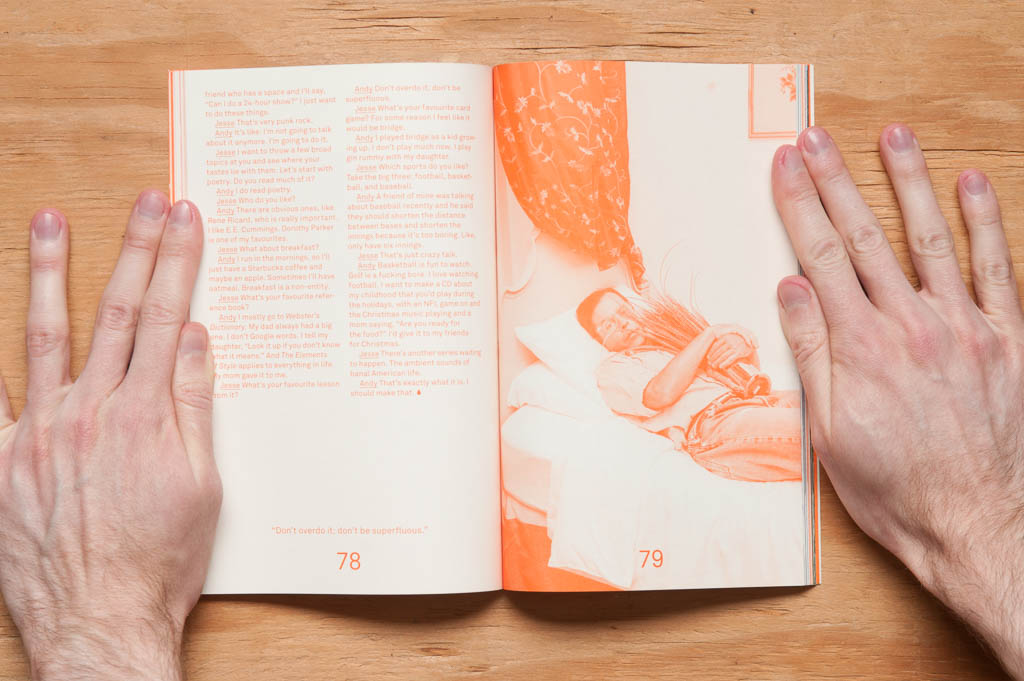
Bad Day issue 18

I just have to briefly mention the website here, too. It looks like it was pulled straight from the magazine itself. Color and typeface are just like the mag. It’s some of the most consistent design I’ve seen from digital to print (or vice versa). Bad Day’s got this branding thing down.

Many art-related magazines—well, many magazines period—have interviews as a mainstay of their content, and Bad Day is no different. In fact, that’s the bulk of the issue. But the difference with BD is the quality of the interviews. They don’t feel like “cold calls”. With each interview, either the interviewer had previous knowledge of the interviewee’s field, seemingly fairly extensively, or in some cases the two had met before. In musician Nicholas Krgovich’s interview, his interviewer, Phil Elverum, has spent “much of the last decade collaborating and touring with him”. This made them feel a little less like interviews and a little more like conversations. The breadth of people interviewed was nice to see too: a sculptor and painter; a musician; a jewelry maker; industrial, furniture, and object designers; an advertiser, and an actress (on the cover—Natasha Lyonne).

BD has been referred to as an “edgier, Canadian-er answer to Interview mag.” I, however, would say that BD is kind of on the opposite end of that same spectrum—”anti-edgy”, if you will—in that BD feels more… accessible in a way. I think that’s because, while some of those interviewed could be considered celebrities in their own rights, several of the interviewees were fairly early on in their careers. They could be any of us. That “accessibility feeling”, for me, could also have something to do with the look, production quality, and size of the magazine too, though.

As for “Canadian-er”? My extent of Canadian-related things I’m vaguely aware of is Bob & Doug McKenzie, mounties, and it’s cold up there, so, there you go.

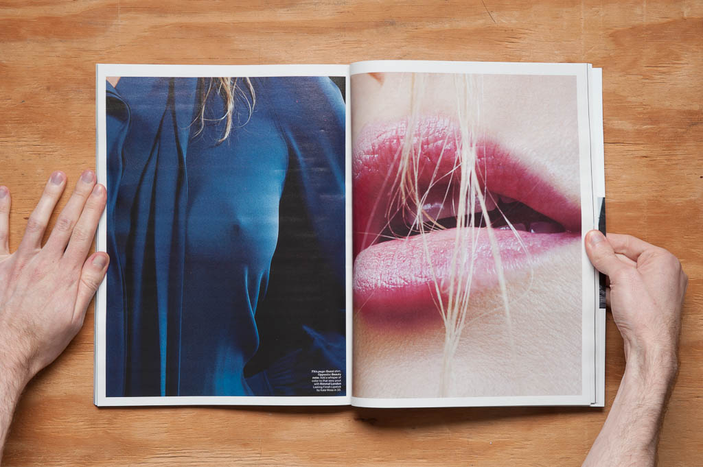
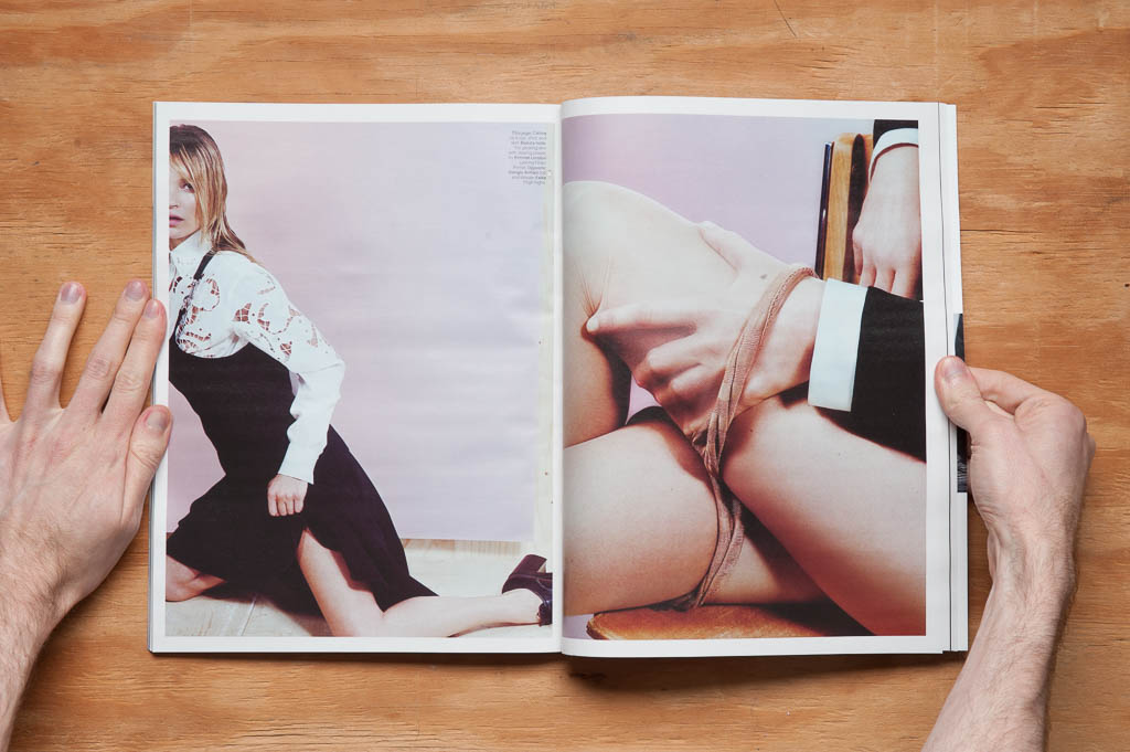
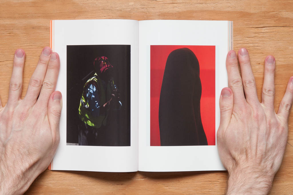
Along with the interviews is a portfolio of art photography by Viviane Sassen and two fashion editorials, all printed on glossy paper (the rest of the mag is a matte stock). I hadn’t known of Sassen before, but my goodness is her work beautiful.

Bad Day issue 18

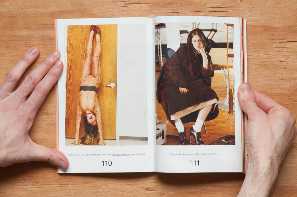
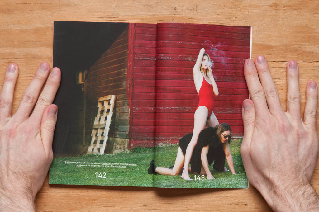
The editorials are great too—fun, sexy, quirky, even a little bizarre at times. Right up my alley.

Bad Day issue 18

Photography by Jason Nocito

Bad Day issue 18

Photography by Brianna Capozzi

Now that I’ve told you how wonderful this issue is, I should probably break it to you that this issue is sold out on their website, as are many of the earlier ones. Issue 12 is still there, and I found others from a few online stores after doing a little digging (i.e. the first page of one Google search). If BD’s previous issues are anything like this one though, you’ll dig them.

Sunday, May 17, 2015 stuffonpaper Permalink Leave a response Art, Fashion, Photography, Bad Day, Colin Bergh, Eva Michon, Viviane Sassen
← Previous 1 … 4 5 6 Next →

Search

Copyright © 2025 Stuff On Paper.

Powered by WordPress and Cascade.