Menu
  • Home
  • About
    • Contact
  • Categories
    • Art
    • Fashion
    • News & Politics
    • Photography
    • Tech
      • Computers and Internet
      • Video Games
  • Twitter
  • Magpile

Stuff On Paper

Magazines (mostly), and why I like them (or don't).

Incandescent: A color film zine, Issues 5 and 6

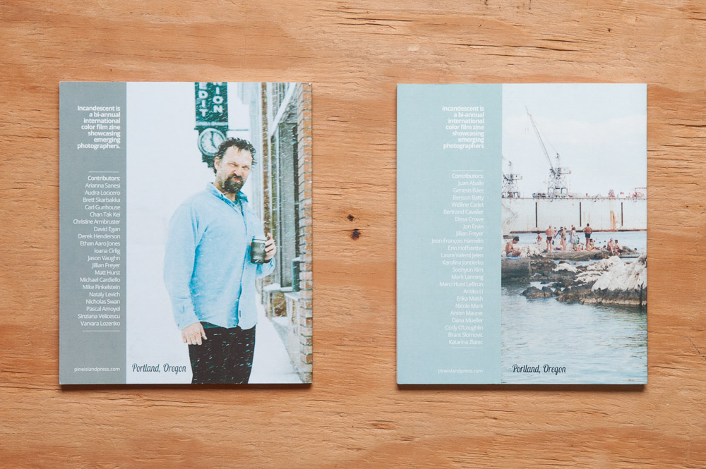
Number of pages: 64, issue 5; 68, issue 6
Frequency at time of publication: Bi-annually
Editors-in-Chief: Marissa Csanyi and Helen Jones
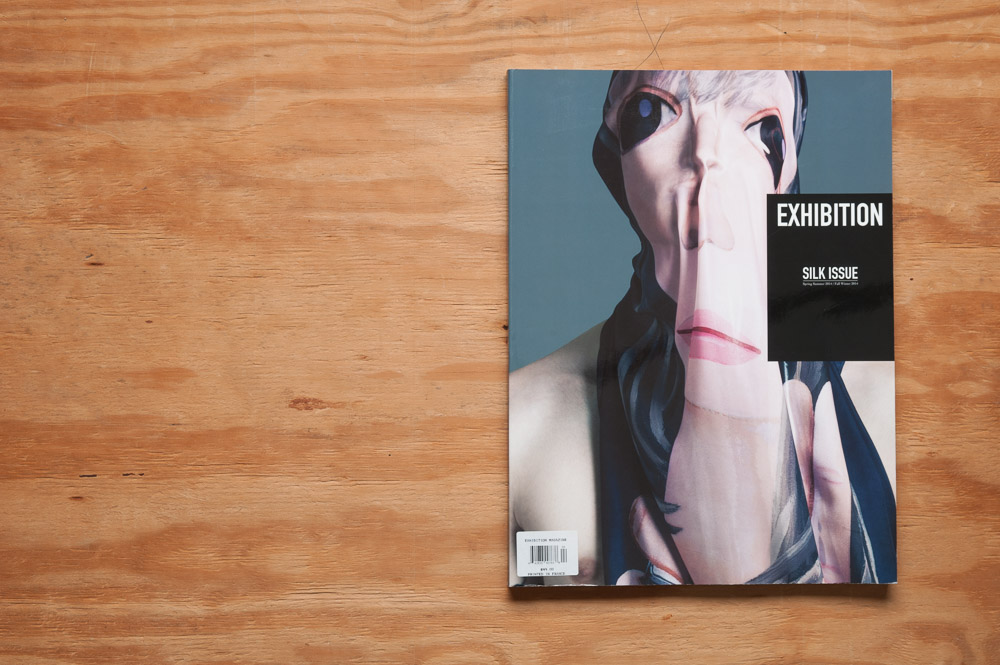
Publisher: Pine Island Press
Still published (as of this post?): Yes
Price: $14 USD each

Incandescent Zine issue 5 and 6 covers

In August of 2014 my photography took an almost 180 degree shift from people (fashion and body work mostly) to, well, anything but people. Since then, I’ve come to a middle ground of multiple photographic interests, but when the shift first came about, I primarily wanted to capture what I’d call these “snippets of the world”, everyday scenes that you normally wouldn’t give a second thought to, but if you stopped for a moment to look, there was something interesting going on there. Sometimes what that interest was might be hard to pin down, but there was something there I just had to capture on film.

It was at this time I began looking for photography like this in ernest. I wanted to see what others were doing and had been doing like this. I wanted to be inspired, and approached my new work like I had never picked up a camera before.

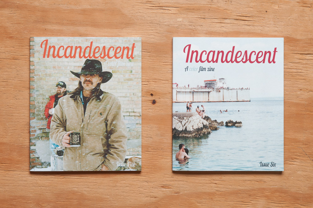
In my search I found the work of some names you might recognize such as William Eggleston and Stephen Shore. But I also found Incandescent. Incandescent is a small “color film zine”, as their tagline says, highlighting color photography from contributors around the world. The only stipulation for submitters is that the images must be shot on film. (In the interest of transparency, I’ve submitted work to them in the past, but haven’t gotten anything accepted yet. Someday!)

Incandescent Zine 062815-9912

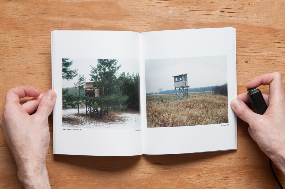
From issue 5, photography by Jason Vaughn

Incandescent Zine issue 5 and 6

From issue 5, photography by Ioana Cîrlig

Each issue starts with a two-page written introduction before jumping straight into the photographs. In issue 5‘s introduction, Paul Cavanagh posited the questions “Am I seeing this right? Am I taking it all in? What is ‘it’? Is what I think ‘it’ is the same thing as what the photographer thinks ‘it’ is? Does it matter?” These were all questions I asked myself when I was essentially discovering this type of photography for the first time. (In at least one case I was discovering it all over again—for example, I had seen Eggleston’s work years before, but hated it back then. It’s interesting how tastes change as time goes on.)

Incandescent Zine 062815-9907

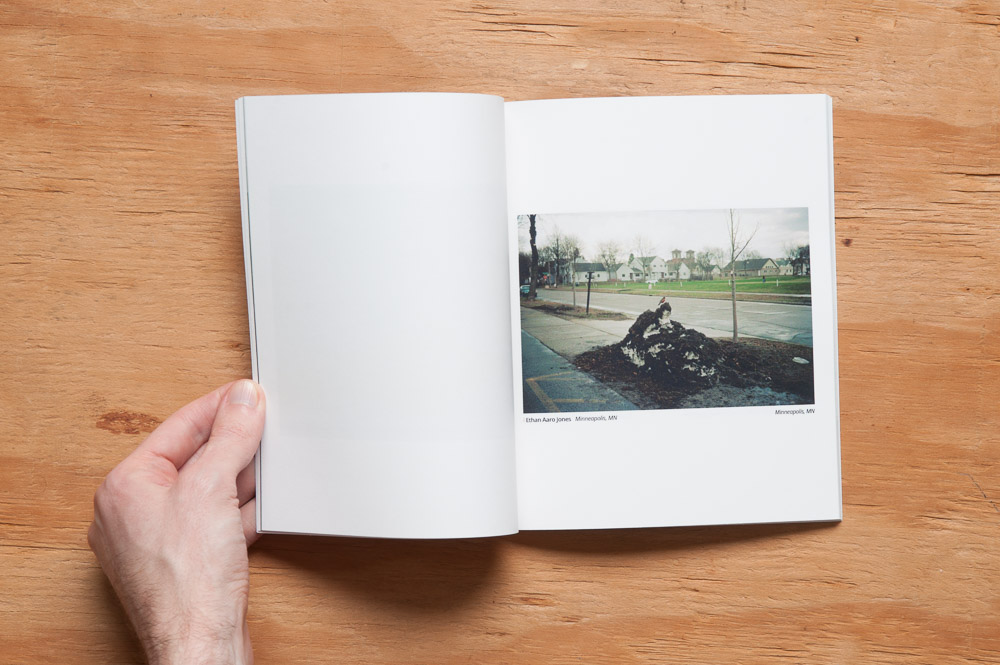
From issue 5, photography by Ethan Aaro Jones

Incandescent Zine issue 5 and 6

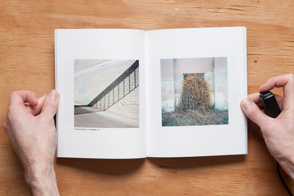
From issue 5, photography by Sinziana Velicescu

These are questions I challenge anyone to ask themselves as they view the work in Incandescent, these moments in the world, wide and expansive or small and intimate, captured and preserved because there was just something about these scenes that made each photographer stop and click the shutter.

Incandescent Zine 062815-9922

From issue 6, photography by Katarina Zlatec

Incandescent Zine issue 5 and 6

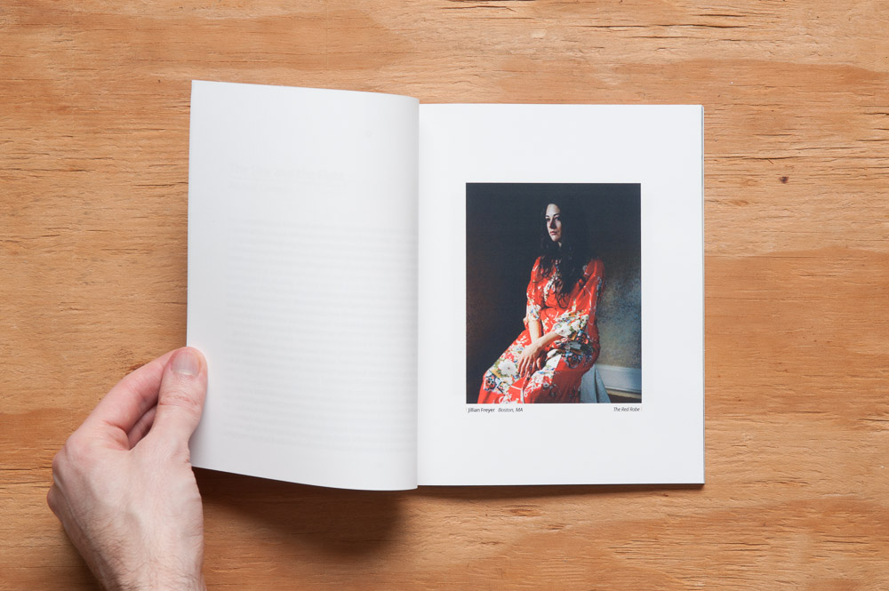
From issue 6, photography by Jillian Freyer

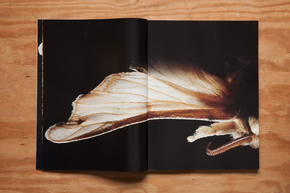
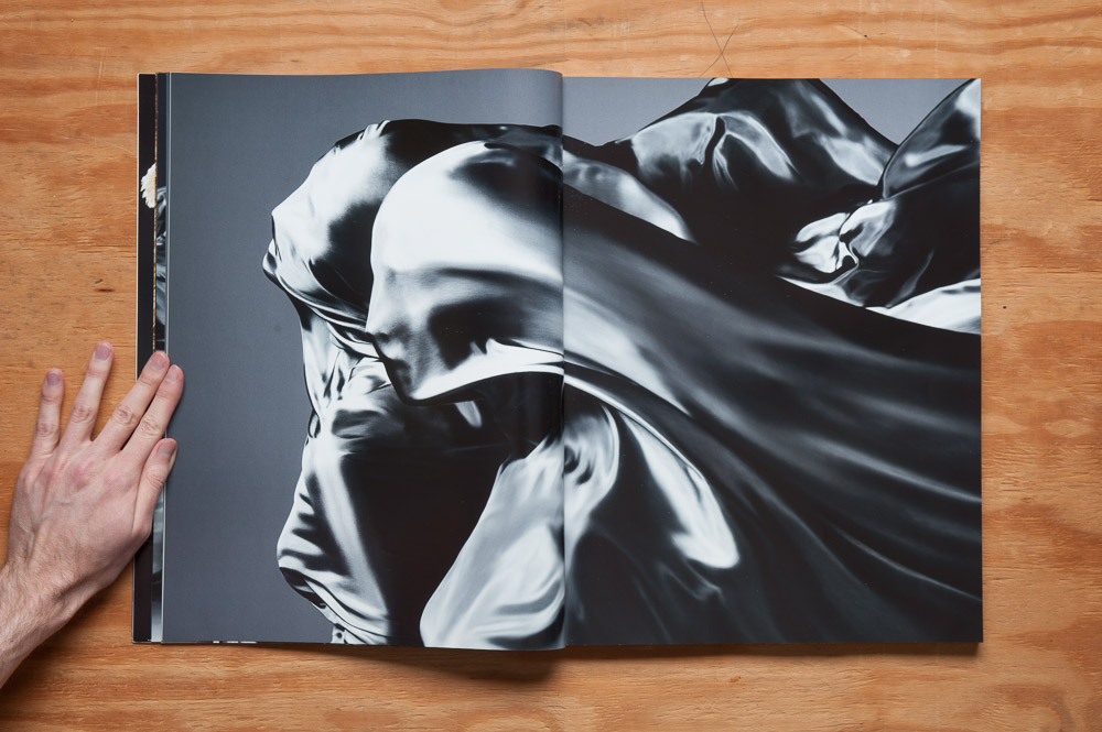
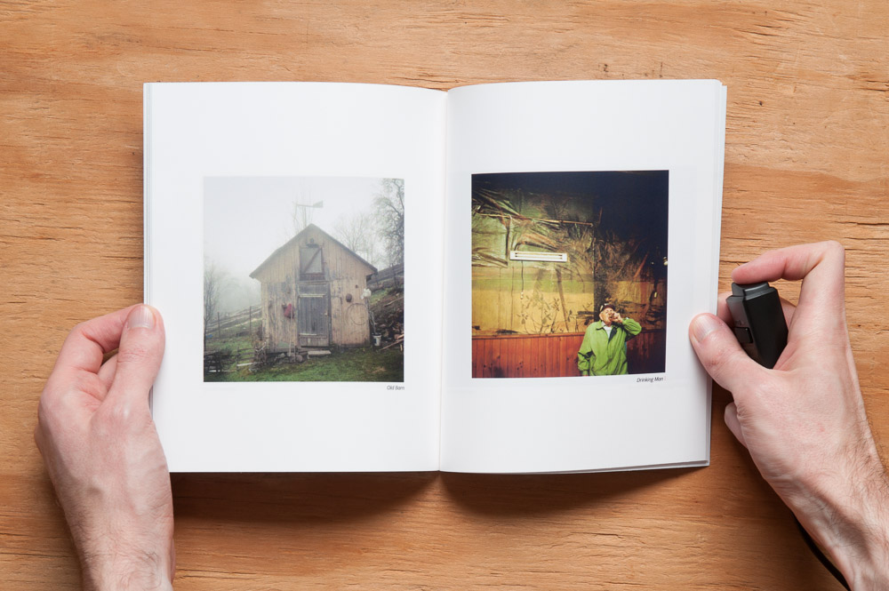
The zine is a portable 6.5” x 8”, printed on a coated matte paper on the publishers’ own small press and bound by hand. The images seem a tad grainy to me, and not in an it-was-shot-this-way kind of way if you get my meaning. I’m not sure if that’s due to the nature of the solid ink printing process they use or not. As it is, I like the look myself; it just seemed worth mentioning. But it’s also worth mentioning that this is a zine! It’s not supposed to be “perfect”, at least in my mind. I rather like knowing the personal care and attention given, and that makes me want to hold onto the issues that much more.

Incandescent Zine 062815-9929

From issue 6, photography by Joe Ervin

Incandescent Zine issue 5 and 6

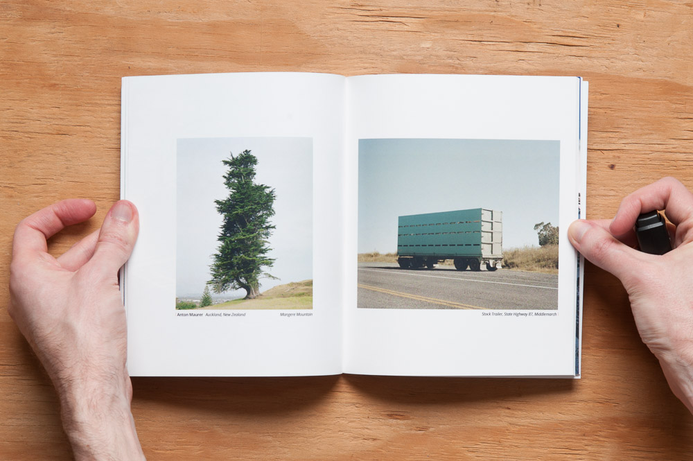
From issue 6, photography by Anton Maurer

Incandescent Zine issue 5 and 6

If you are at all interested in the works of Eggleston, Shore, and the like, I highly recommend this zine.

Monday, June 29, 2015 stuffonpaper Permalink Leave a response Photography, Incandescent, zines

Can we just talk about this “Lady Warrior” ad for a minute?

Realms of Fantasy ad, February 1999

Conveniently nestled between ads to meet Asian and Russian ladies, this ad in the February 1999 issue of Realms of Fantasy (a sadly now defunct magazine of fantasy fiction) was for a portfolio of eight pictures of women brandishing swords and shields. (Asians, Russians, Barbarians, take your pick!) Based on the accompanying picture though, and their pointing out that this portfolio “contains nudity”—as an invitation, I assume, not a warning—I’m guessing these warrior princesses are more lovers than fighters.

What I don’t get is sending in $2 for more information. More information about what? What else is there to say other than what’s already there? Here’s one scenario:

Johnny McJohnny wants more information regarding the Lady Warrior Portfolio Volume II.“Yes, I’d like more information about the Lady Warrior Portfolio Volume II, please,” he writes. About a week after they (“they” being the lady warriors I guess?) receive his check for $2 and information request, Johnny gets a letter postmarked from Paradise, New Jersey—er, excuse me, I read that wrong. I guess that’s the name of one of the lady warriors living in the city of Brigantine. I really like the idea of Paradise being in New Jersey, though. But it is nice to think that there are a bunch of barbarian women running around this small town in Jersey, just because, you know, that’s just the way it is up there. Like Wonder Woman and Paradise Island.

Hmm… Brigantine is an island city… Could it be…

Naaah. Moving on.

Johnny opens the envelope, smelling of rosewater and large roasted fowl. “Thank you for your request for more information regarding the Lady Warrior Portfolio Volume II”, reads the letter inside. “Please see our ad in the February issue of Realms of Fantasy. Thank you!”

“Yes, thank you”, Johnny replies in another letter. “I saw that ad, which said to send in $2 to request more information, which is what I did. I’d like more information about the portfolio, please.”

A week later, “Thank you for your request for more information regarding the Lady Warrior Portfolio Volume II. Please send a check or money order for $2 for more information. Thank you!”

Johnny sends in his check and reply. “Okay, here you go. Now may I please have more information?”

Another week goes by. “Thank you for your request for more information regarding the Lady Warrior Portfolio Volume II. The Portfolio is a collection of eight full-color photographs on 8 1/2 x 11 stock. Contains nudity.”

He writes back (not forgetting his $2 check), “Yes, that information was in the ad. Is there anything else you can tell me about them than besides what’s already in the ad?”

A week later: “Thank you for your request for more information regarding the Lady Warrior Portfolio Volume II. What would you like to know?”

Another letter/check combo: “Well, do all the other pictures look like the photo in the ad? And just how much nudity is in these images?”

Another week, another reply: “Thank you for your request for more information regarding the Lady Warrior Portfolio Volume II. No, the images are different. Printing one image eight times would just be silly.

Regarding nudity: how much nudity is contained in the images is ‘yes’, the ‘yes, there is nudity’ amount.”

After spending $74 and waiting 37 weeks on information, Johnny McJohnny, feeling defeated, gives up and slowly downloads extremely low-resolution images of relatively-scantily-clad-yet-otherwise-appropriately-clothed fantasy cosplayers with his new 56K modem.

But hey, I’m not judging. If you (or Johnny McJohnny) prefer your Red Sonjas a little less Brigitte Nielsen and a little more Elizabeth Berkley, that’s cool. That’s just not exotic enough for me. Now if you’ll excuse me, I’m ordering myself an Asian bride. Robot. A robot Asian bride. Hey, I didn’t judge you. Weirdo.

Wednesday, June 24, 2015 stuffonpaper Permalink Leave a response Can we just talk about this for a minute?, Realms of Fantasy

Exhibition Magazine: The Silk Issue (Issue 4)

Number of pages: 170
Frequency at time of publication: Annually
Editor-at-Large: Boris Ovini
Publisher: Thomas Guénoun
Art Directors: Gaël Hugo and Edwin Sberro
Still published (as of this post?): Yes
Price: $49 USD

Exhibition Magazine, Issue 4 (The Silk Issue) cover

Exhibition Magazine is gorgeous.

Exhibition Magazine 061915-9836

Photography by Dan Tobin Smith

Let me repeat that.

Exhibition Magazine is GORGEOUS.

Exhibition Magazine 061915-9839

Photography by Sølve Sundsbø

It gathers the work of some extremely talented photographic artists based around a theme for each issue—in this case, silk—and puts it in a huge 330 x 440 mm (about 12 x 17 inches) coffee table book.

Photography by Maurice Scheltens and Liesbeth Abbenes

Paper stock oscillates between glossy and matte, and the choice for each story fits them to good effect.

Photography by Luigi Murenu and Daniele + Iango

Photography by Pierre Debusschere

Editorial layout notwithstanding, what little graphic design there is (this is for all intents and purposes a book of photography, after all) is either big and bold, as of the editorial title pages, or a simple four-column layout for the essays interspersed among the editorials. It’s all very simple in fact, and keeps the focus on the most important parts of this magazine, the photography.

Exhibition Magazine 061915-9850

Photography by Emma Summerton

Now about those essays…

There are four of them, each relatively short, taking up no more than about a half a page each (which might amount to a couple of pages in a standard-sized mag). Each essay discusses someone involved with, in one way or another, silk or scarves: Bali Barret, creative director for women’s at Hermès; Isa Genzken, a sculptural artist; Paul Graves and Frank Wilde, artists in their respective ways and, in particular here, collectors of Rudy Gernreich scarves; and a compare-and-contrast of Isadora Duncan and Gaëtan Gatian de Clerambault, she one of the world’s most influential dancers, he a psychiatrist who studied “silk erotomania”.

Honestly though, I feel like the magazine would be better served without the essays altogether. The magazine feels like it wants to be just a collection of fashion editorials (and the website, a customized tumblr, reinforces that feeling). I wonder if the publishers felt like they had to put a few essays in, but at the size it is, and with the quality of the images, it has such a commanding presence with the images alone that the essays feel almost like an afterthought. Even the name Exhibition made me wonder upon first flipping if it were going to be images only. A portable, uh, exhibition, if you will. (There actually was an exhibition of some of the images in this issue in Paris, which I’m sure was amazing.)

Don’t take my wanting the essays snipped to mean I thought they were bad, though. Sure, one of them had some spelling errors and odd-though-not-gramatically-incorrect ways of putting things, which I think had to do with the author not being a native English speaker, but I can let that slide, because I am a native English speaker, and I often write things that have spelling errors and odd-though-not-gramatically-incorrect ways of putting things (sometimes even odd-and-not-not-gramatically-incorrect ways of putting things). (By the way, for an odd-though-not-gramatically-incorrect sentence, please see the previous sentence.)

Of course I haven’t the slightest idea what Exhibition’s founders intended for it, nor will I speculate. As there are only four small essays within its 170 pages, I know it sounds like I’m making a mountain out of a molehill, or even a no-hill, and maybe I am. All I know is what it feels like the magazine wants to be to me—just a book of beautiful images. And when the images are this good, there’s absolutely nothing wrong with that.

Exhibition Magazine 061915-9854

Photography by Glen Luchford

Exhibition Magazine 061915-9865

Photography by Daniel Jackson

Exhibition Magazine 061915-9866

Photography by Suzie Q + Leo Siboni

Exhibition Magazine 061915-9868

Photography by Paul Lepreux

Incidentally, you can see many of the images in this issue on Exhibition’s website. Issue 5 (the “Powder Issue”) is out now, so I’m assuming the images for issue 4 were put online after issue 5 went on sale. But seeing them on a screen pales in comparison to seeing them printed up big and as beautifully as they are. Check this one out if you can.

Exhibition Magazine, Issue 4 (The Silk Issue) back cover

Sunday, June 21, 2015 stuffonpaper Permalink Leave a response Art, Fashion, Photography, Exhibition Magazine
← Previous 1 2 3 4 … 6 Next →

Search

Copyright © 2025 Stuff On Paper.

Powered by WordPress and Cascade.