Foreign Policy, issues March/April and July/August, 2015
Number of pages: 88 and 112 pages, respectively
Frequency at time of publication: Bi-monthly
CEO and Editor, the FP Group: David Rothkopf
Executive Editor, Print: Mindy Kay Bricker
Publisher: Amer Yaqub
Art Director: Ed Johnson
Still published (as of this post?): Yes
Price: $8.99 USD
I’m fascinated by my fascination with Foreign Policy.
I’m not a “politics guy”. I know, we all should be “politics guys” or gals to some degree, but news and politics is something that I don’t watch or read a lot of. The news reported in most media outlets is depressing (and if it’s bad enough I hear about it either way from friends or family), and the talking heads on news shows in particular just make me think of kids bickering at a playground. I’d much rather spend my time watching a TV show/movie/documentary/anything with good storytelling, and that’s when I watch TV at all.
The politics of international affairs often captures my attention even less because it tends to feel far away and unrelatable.
So to reach someone like me, you have to work a little harder. How do you do it? For starters, you reel me in with good visuals.
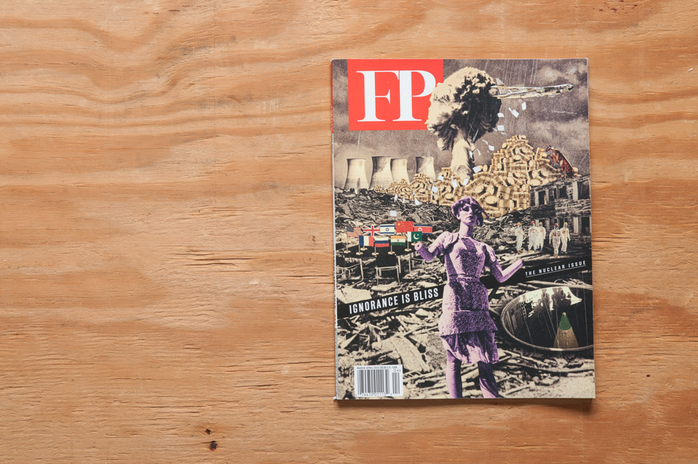
I know the exact day I bought my first issue of Foreign Policy. It was April 7 of this year. I remember because I was in an airport (and can still look up my itinerary!), and the March/April cover stood out to me on the stand. It was the surrealism of it that got my attention, and even though the central figure is a mannequin, the fact that she doesn’t have any hands still has a rather macabre feel to it (and I’m always drawn to that sort of thing). Once I realized what type of magazine it was, however, I dismissed it at first. I thumbed through other magazines for a while, but I kept coming back to this issue of FP. I guess it wasn’t as dramatic a moment as it sounds—there was no spotlight or angelic music, as I recall—but the fact that I couldn’t leave without it says something for the power of a good cover, at least.
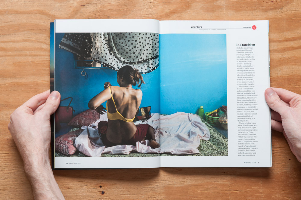
But it wasn’t the cover alone. After just a few minutes, it became clear how important it was to FP to appeal to our sense of aesthetics. One of the first things in the magazine (and one of the first things I noticed as I was skimming through it in the airport) is not a written essay, but a regular piece called Aperture, which is a photo essay. I love this because photo essays by their nature deal on the level of individuals or small groups (in this case a transgender woman in India) as opposed to large groups of faceless numbers.
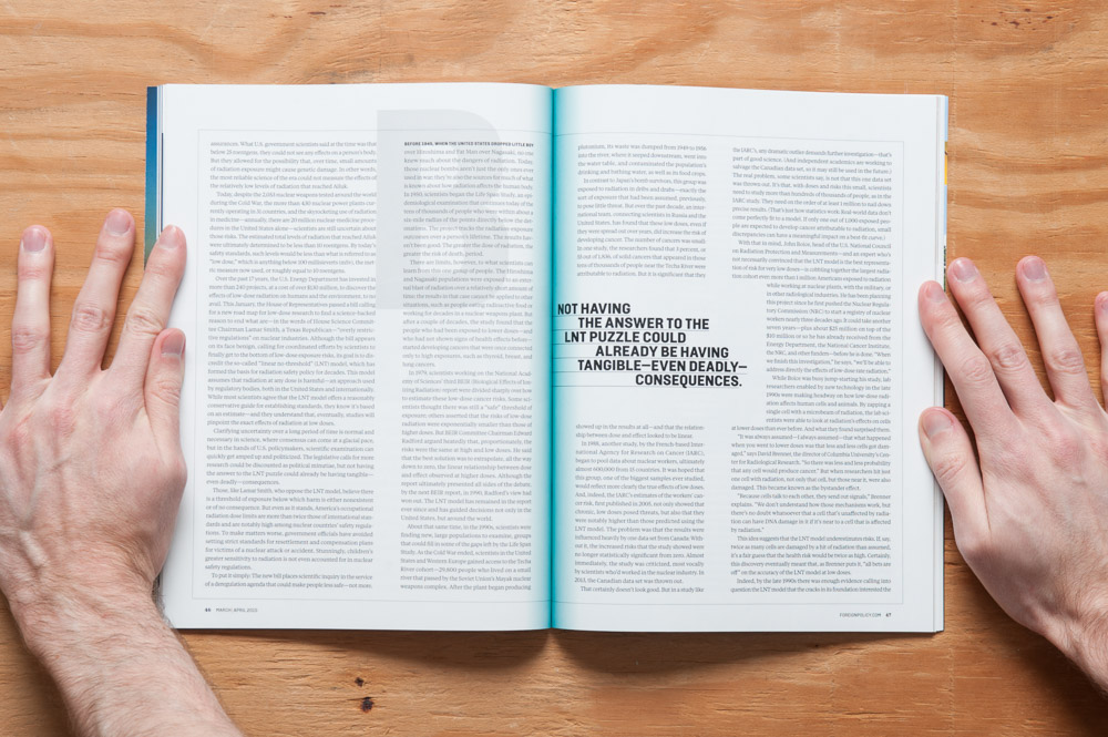
The next thing that caught my eye was something in a feature called “Unexposed” that talks about the safety (or lack thereof) of low-dose radiation.
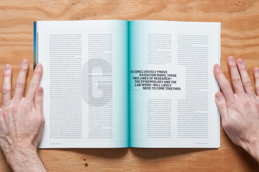
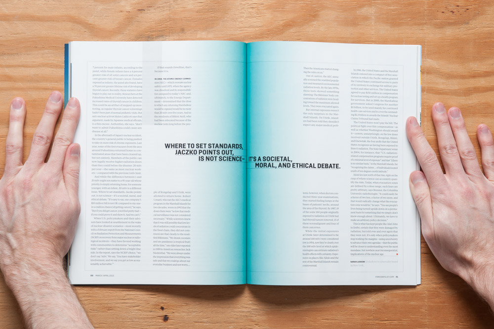
Look closely. See the blue in the gutter? Over the next few pages it spreads a little more and a little more.
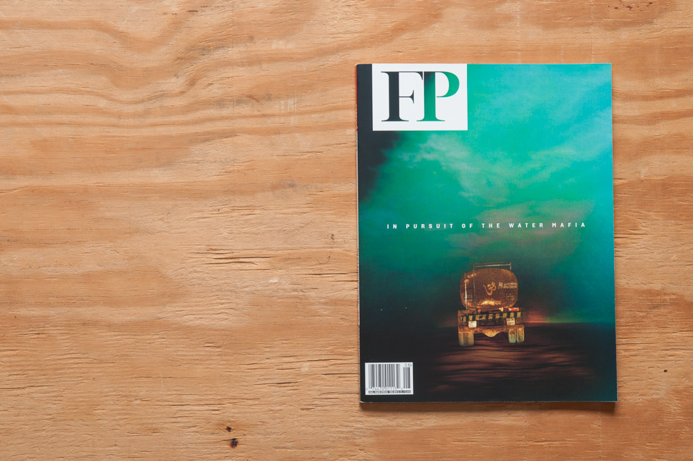
It’s a design treatment that deftly reinforces the idea of this seemingly inconsequential problem insidiously becoming bigger and bigger. (When I first saw the opening spread I did a double-take because I thought I was seeing things.) It’s those spreads that did it. I bought the issue, content with the fact that if anything there was some good graphic design going on in there. I brought it home and… …like I often do, tucked it away in a stack of other magazines and forgot about it for a while. That happens more often than I’d care to admit. You see, just as much as I like reading magazines, I like collecting them too, and “collecting” is just a nice way of saying “hoarding things in an organized manner”. So there it sat for a few months. Fast forward to two issues later, and I noticed the cover of the July/August issue in the stands. (I had seen the May/June issue, but the cover didn’t excite me as much for some reason, so I never picked it up.) Aside from being an eye-grabbing photo in it’s own right, the cover image made me think of Mad Max: Fury Road, which I’m sure on some level affected my purchase choice. No matter whether the cover was subconsciously appealing to my love of 80s-style action movies or not, kudos to FP for another great cover. After buying two issues of a type of magazine I normally would have no interest in whatsoever, I figured “Okay, I have to review Foreign Policy”.
Reading magazines for the first time is like dating: they get you with their looks, but they keep you with their personality. Or in other words, their content. (Well, if they’re really good-looking they might be able to keep you around regardless of their personality. That applies to women and magazines, but I digress!) You already know I like the design. There’s more to talk about, but let’s also get into the meat of the magazine. Each issue is broken down into three sections: Sightlines, Features, and Observation Deck.
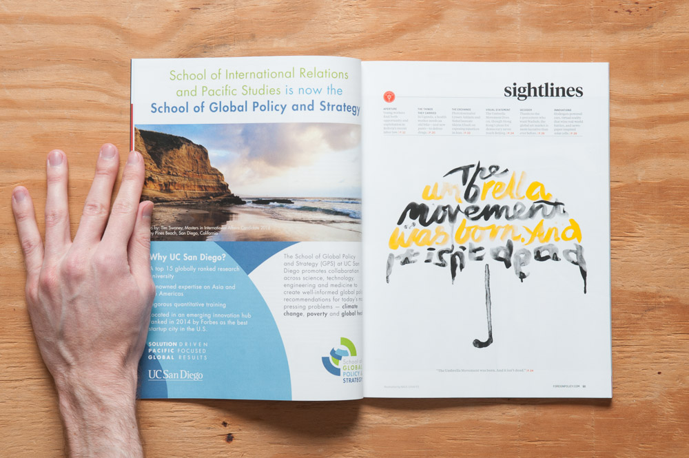
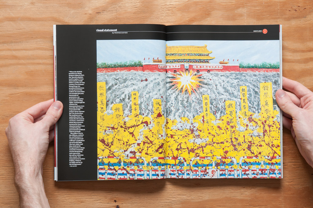
Each section leads off with an opener featuring an illustration based on something within that section, such as this one from the Sightlines section.
Sightlines is a group of bite-sized columns that provide small insights (I’m pretty sure there’s a pun there) on cultures, ideas, and technologies around the world. This section is overall graphics-heavy and people-centric. To get into detail on each piece in each section would make for an overlong review (not that my reviews are short to begin with), but below I have examples of each to give an idea of what’s there.
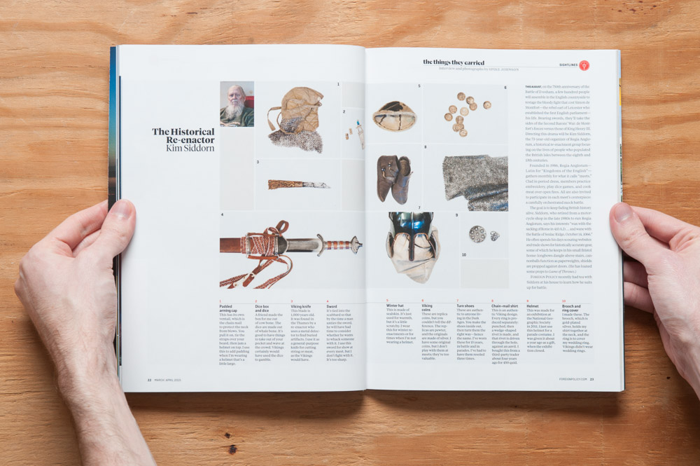
The Things They Carried is exactly what it sounds like: a short bio on someone and the things they carried with them for their work. March/April.
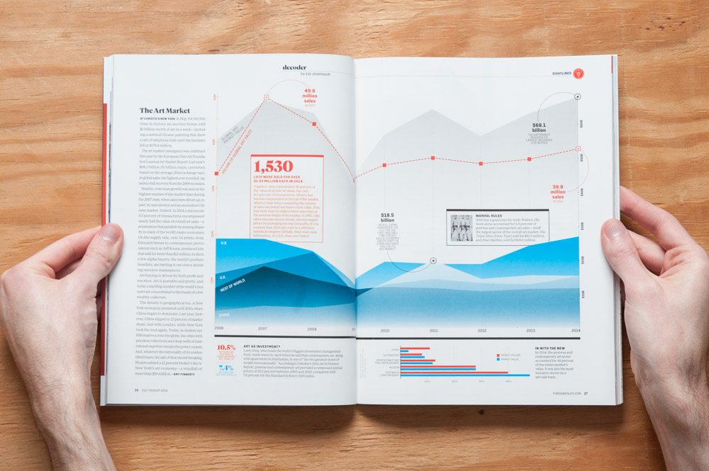
Decoder is a graphically-based column (chart, infographic-ish illustration, etc.) that attempts to explain or analyze something, i.e. decode it (don’t act so surprised). July/August.

Innovations is brief mentions of inventions and technological strides from around the world. March/April.
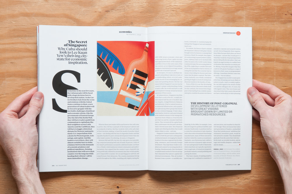
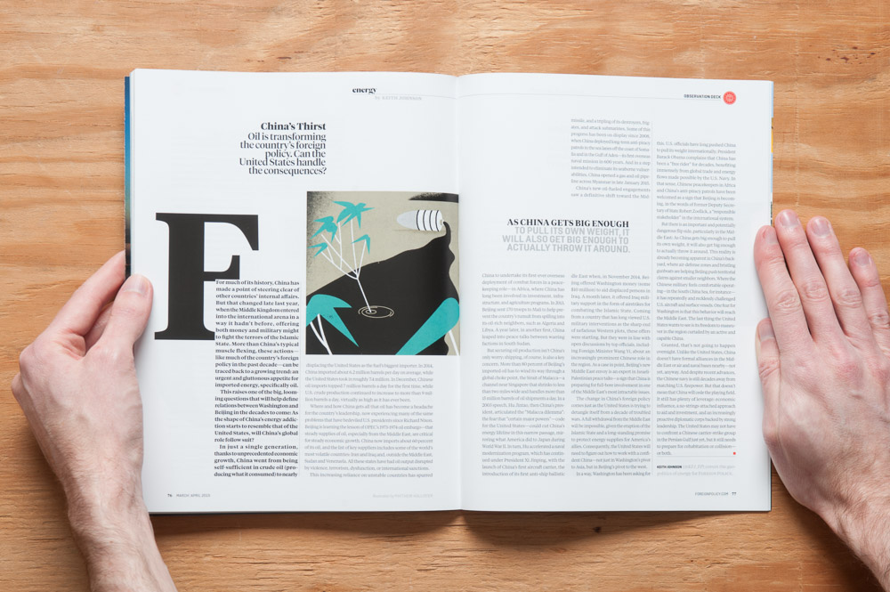
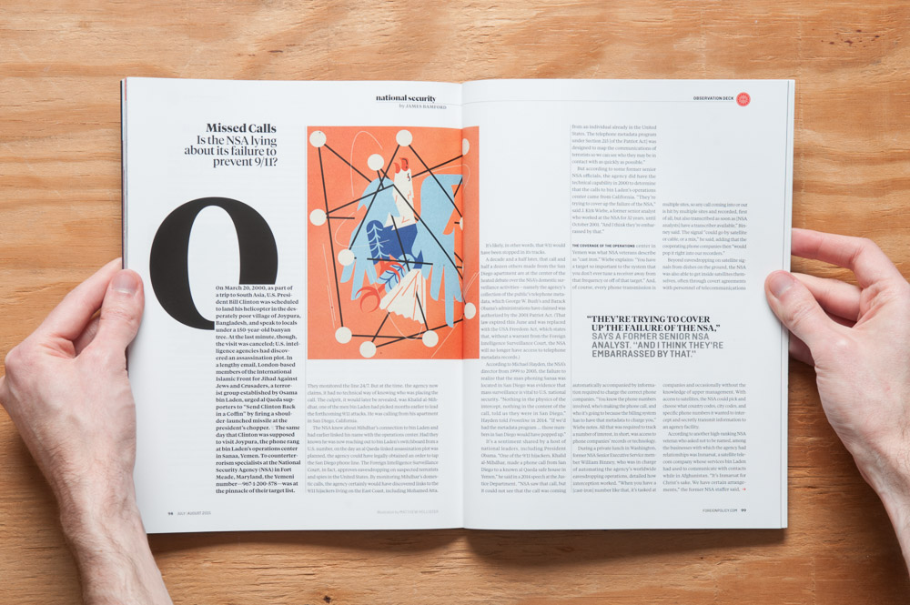
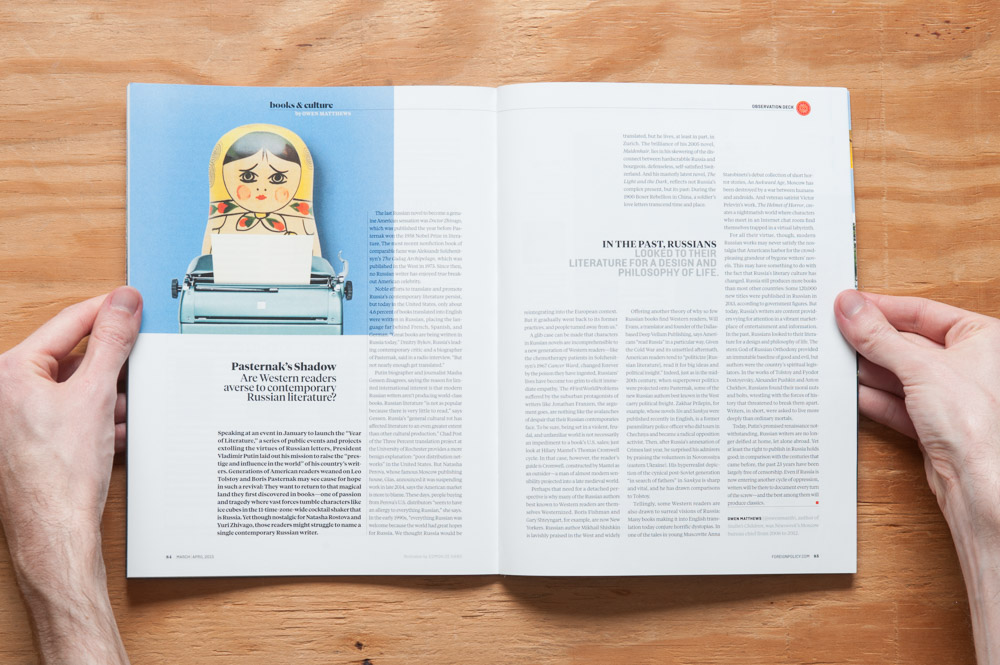
The next section is Observation Deck which is mostly editorials on regular topics such as the economics of foreign markets and national security, along with thoughts on foreign books and culture, and ending with The Fixer, a mini-tour of that fixer’s city (and before FP I didn’t even know what a fixer was).
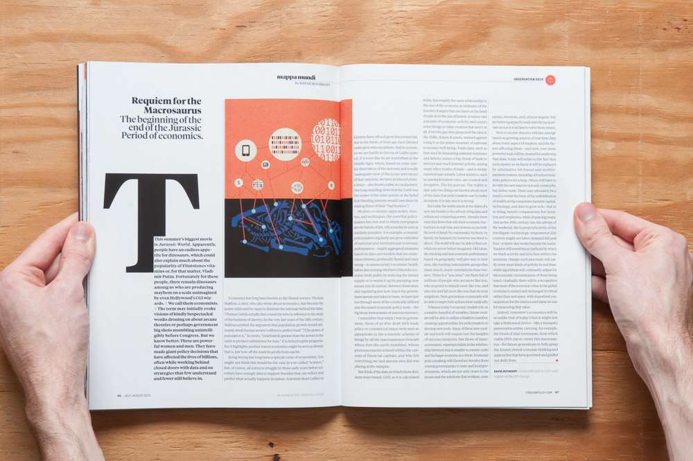
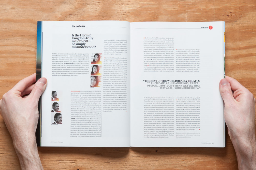
Mappa Mundi as best I can tell is an editorial about whatever FP’s editor the FP Group’s editor and CEO wants to write about. FP doesn’t have an editor’s letter, so this most closely takes the place of that I think. It’s not an editor’s letter, as it’s not about what’s going on in the magazine—the Feature’s opening page takes the place of that—and it’s not written by the print editor. Instead, it’s a letter about something going on in the world. Are you still reading this caption? July/August.*
The features, probably unsurprisingly, are my favorite part of the magazine. All of them were well written and illuminating regarding their respective topics. The ones I enjoyed the most, however, all had one thing in common: they told the stories of real people, and used that as a means to illustrate and lead into a discussion of a broader global or foreign issue, i.e. the crux of that feature’s topic.
Features are also, of course, where designers can work a little more freely while still maintaining the magazine’s style. While doing research for this review, I discovered that FP just went through a redesign earlier this year. I don’t know what their previous design looked like, but the style I’m seeing here makes me think of other current business or “modern” magazines—not as designed as Wired, but something along the lines of Harvard Business Review cranked up to 11 (and HBR is a well-designed magazine in its own right).
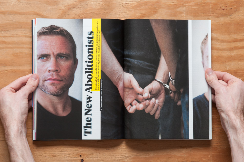
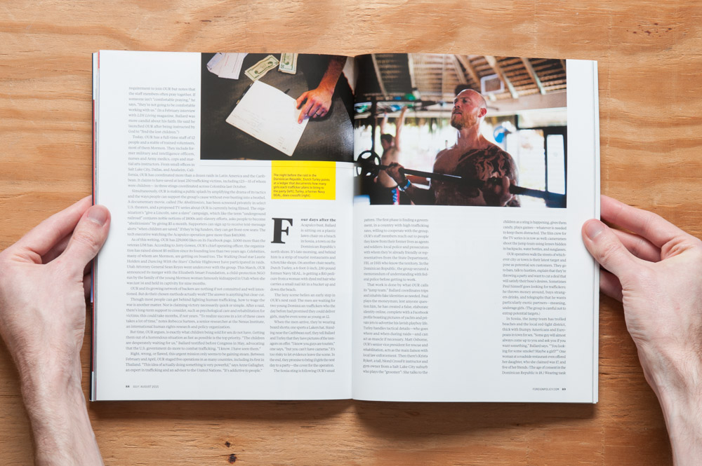
“The New Abolitionists” is a feature in the July/August issue about an undercover group that rescues kids from sex trafficking.

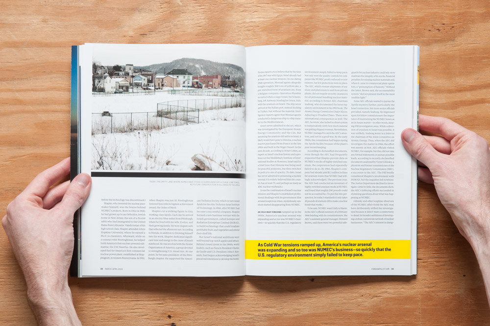
“What Lies Beneath”, a feature on what happened to hundreds of pounds of uranium from a nuclear facility in Pennsylvania in the 1960s (spoiler—no one really knows!). March/April.
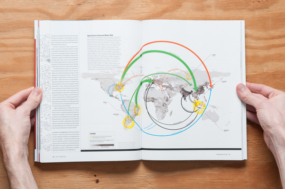
Some of them were more explanatory (and possible-solution-ey), less storytell-ey, but dangit if the illustrations didn’t look good:
Each issue is based around a theme—these being the Nuclear and the Food and Water Issues, respectively—and the features are where the themes kick in, followed by some of the smaller pieces. Not every piece follows the theme, but for everything in each issue, I think that would be difficult to do, and it didn’t bother me.
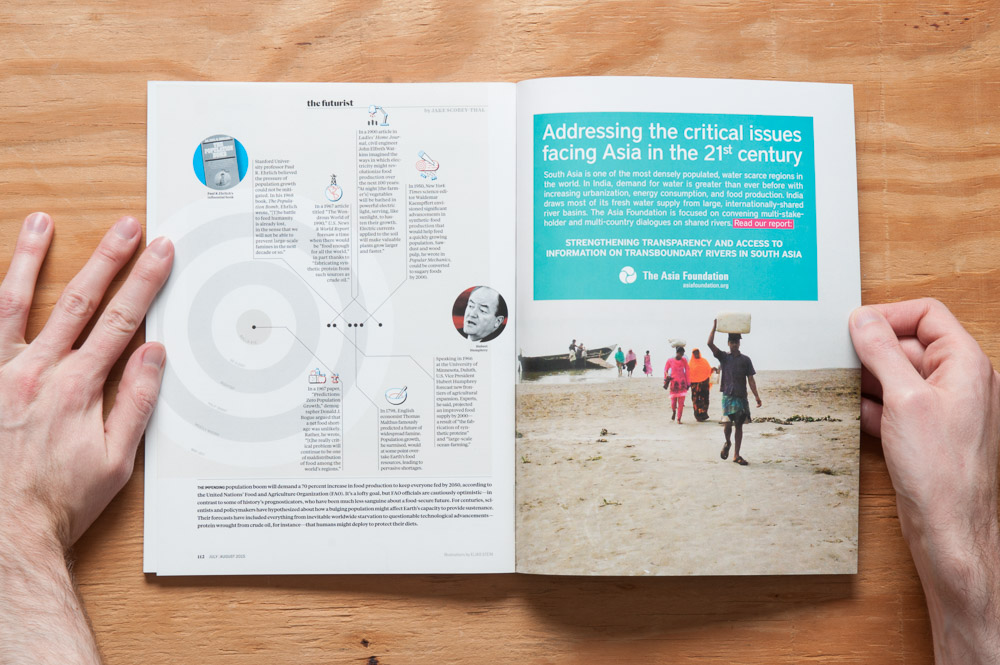
The last page in the magazine is “The Futurist”, an infographic based on the issue’s theme, looking at past predictions and seeing what we got right and what we got wrong.
Foreign Policy strikes a satisfying balance of information and good storytelling. But just as importantly, their content isn’t bogged down by dull visuals. FP clearly understand that good design can elevate content. Be sure to check out an issue if you’re looking for some style with your global-affairs substance.
*Regarding the edits: I had a lovely email exchange with FP’s Executive Editor for Print, Mindy Kay Bricker, who clarified some things regarding the magazine for me. Thanks Mindy!
