Number of pages: 170
Frequency at time of publication: Annually
Editor-at-Large: Boris Ovini
Publisher: Thomas Guénoun
Art Directors: Gaël Hugo and Edwin Sberro
Still published (as of this post?): Yes
Price: $49 USD
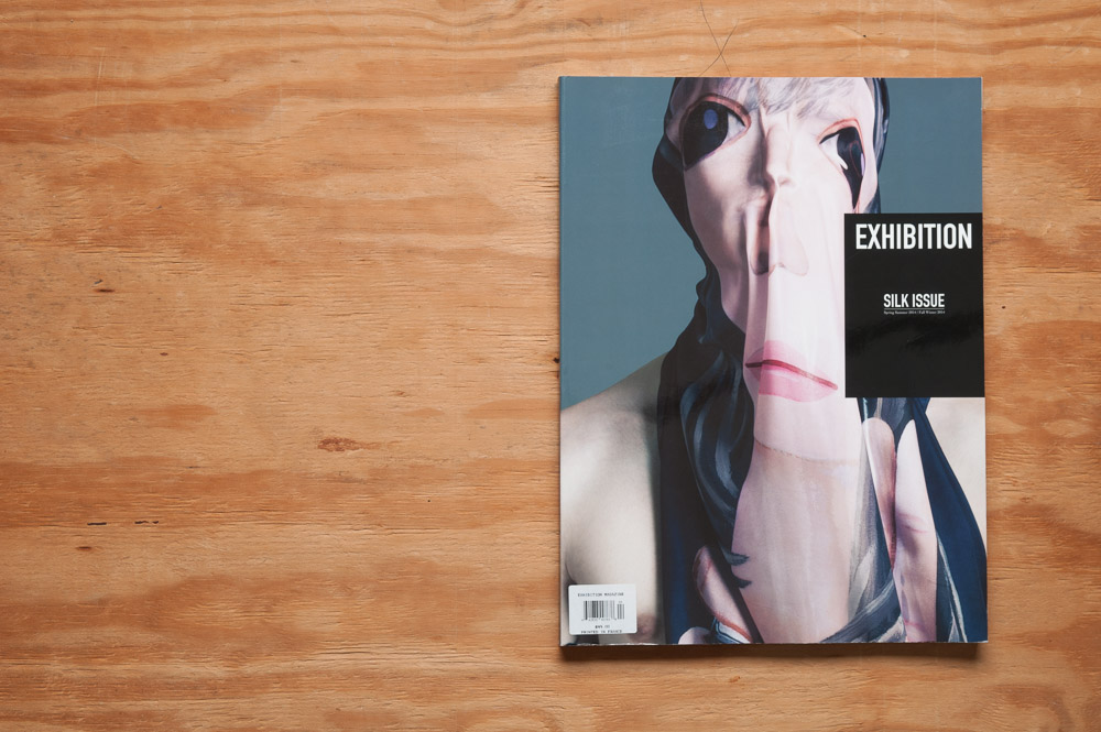
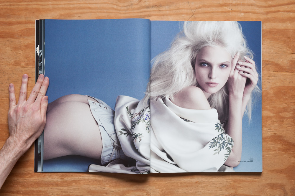
Exhibition Magazine is gorgeous.
Let me repeat that.
Exhibition Magazine is GORGEOUS.
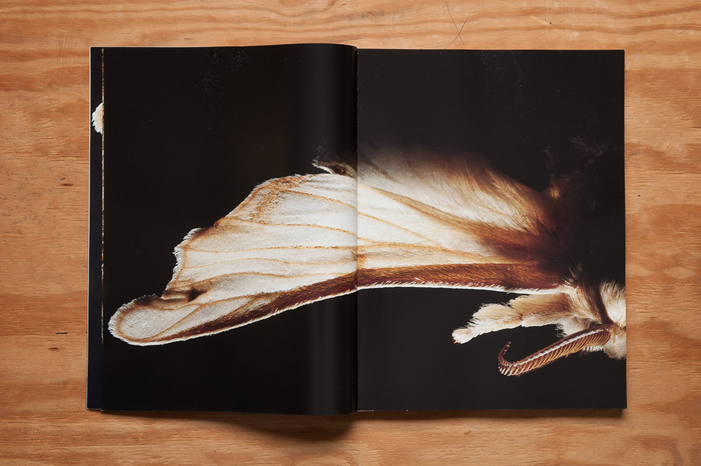
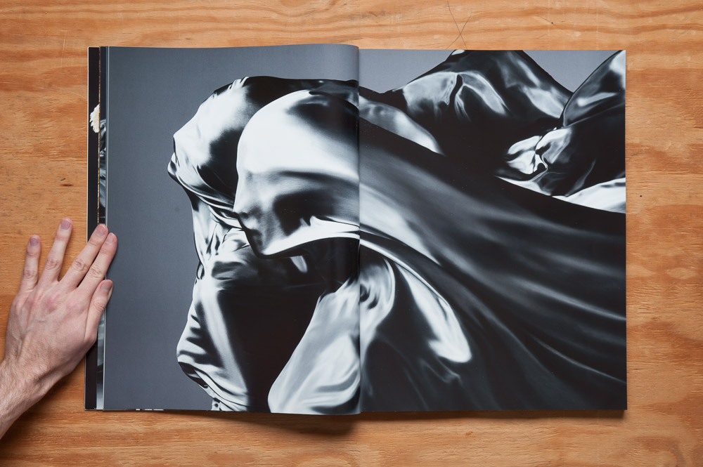
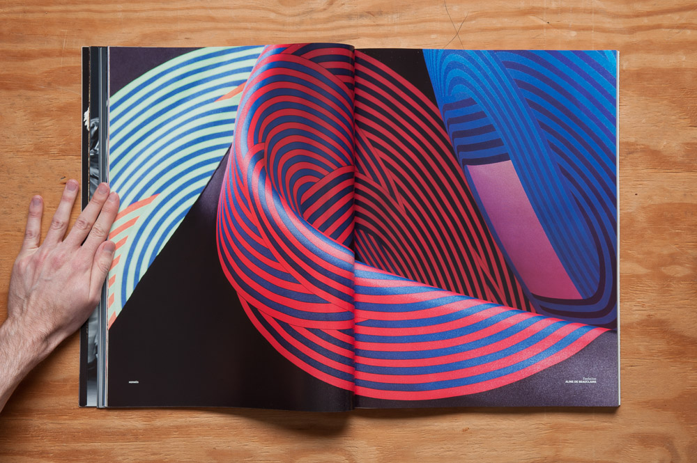
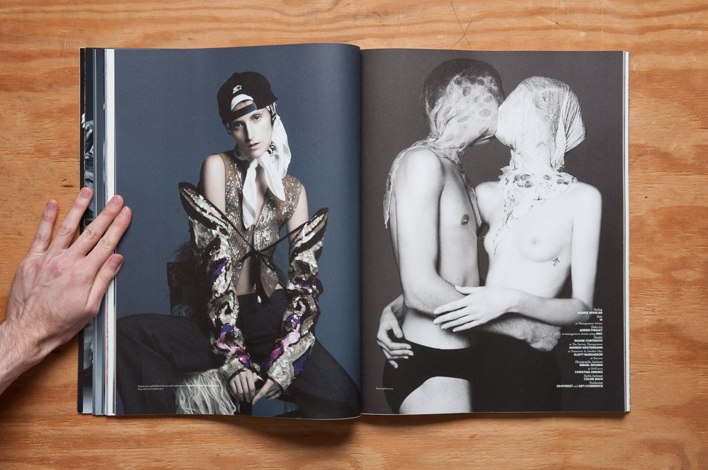
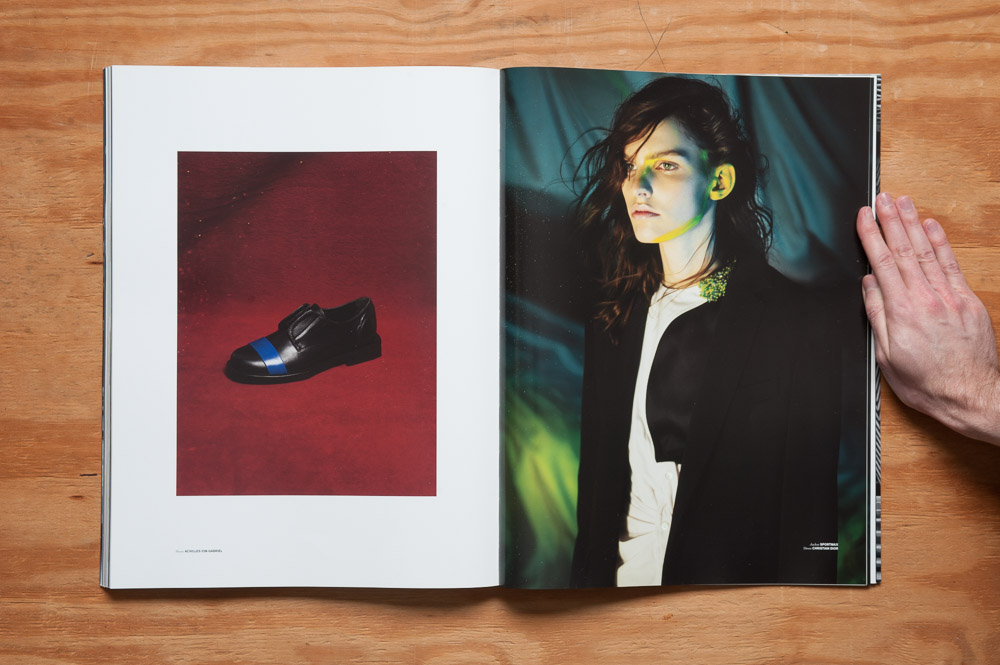
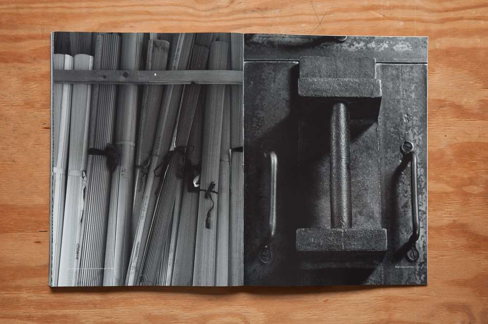
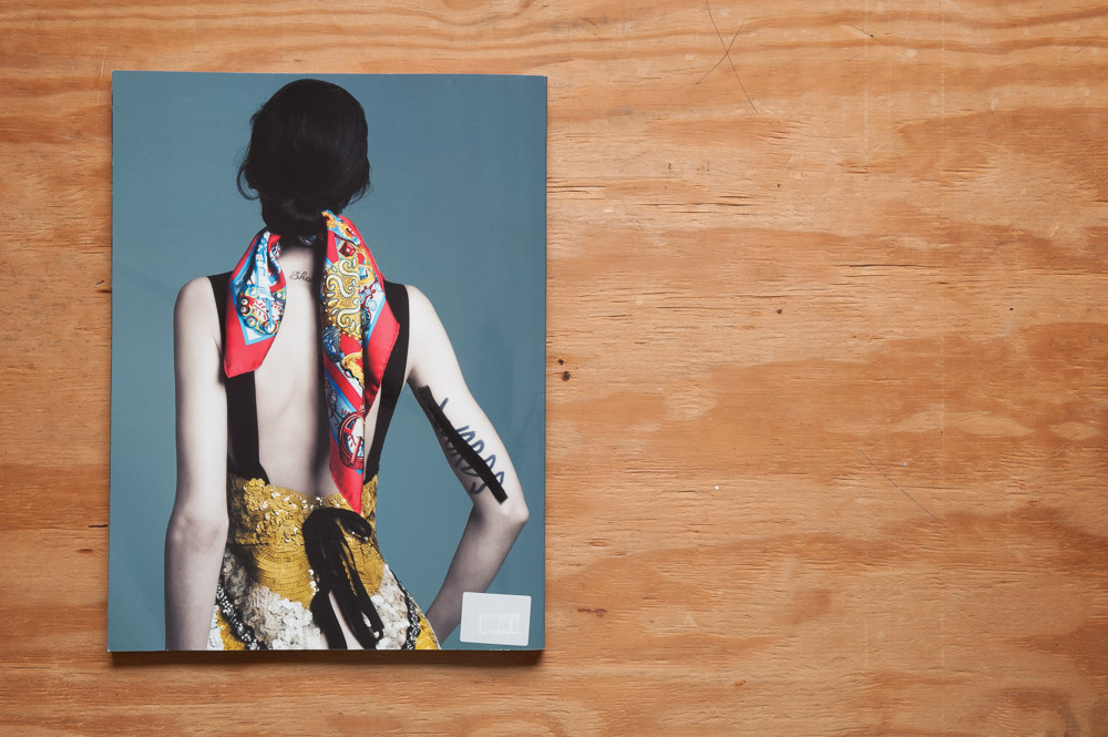
It gathers the work of some extremely talented photographic artists based around a theme for each issue—in this case, silk—and puts it in a huge 330 x 440 mm (about 12 x 17 inches) coffee table book.
Paper stock oscillates between glossy and matte, and the choice for each story fits them to good effect.
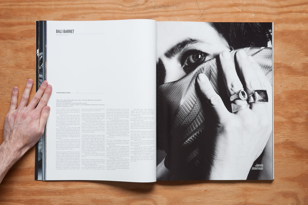
Editorial layout notwithstanding, what little graphic design there is (this is for all intents and purposes a book of photography, after all) is either big and bold, as of the editorial title pages, or a simple four-column layout for the essays interspersed among the editorials. It’s all very simple in fact, and keeps the focus on the most important parts of this magazine, the photography.
Now about those essays…
There are four of them, each relatively short, taking up no more than about a half a page each (which might amount to a couple of pages in a standard-sized mag). Each essay discusses someone involved with, in one way or another, silk or scarves: Bali Barret, creative director for women’s at Hermès; Isa Genzken, a sculptural artist; Paul Graves and Frank Wilde, artists in their respective ways and, in particular here, collectors of Rudy Gernreich scarves; and a compare-and-contrast of Isadora Duncan and Gaëtan Gatian de Clerambault, she one of the world’s most influential dancers, he a psychiatrist who studied “silk erotomania”.
Honestly though, I feel like the magazine would be better served without the essays altogether. The magazine feels like it wants to be just a collection of fashion editorials (and the website, a customized tumblr, reinforces that feeling). I wonder if the publishers felt like they had to put a few essays in, but at the size it is, and with the quality of the images, it has such a commanding presence with the images alone that the essays feel almost like an afterthought. Even the name Exhibition made me wonder upon first flipping if it were going to be images only. A portable, uh, exhibition, if you will. (There actually was an exhibition of some of the images in this issue in Paris, which I’m sure was amazing.)
Don’t take my wanting the essays snipped to mean I thought they were bad, though. Sure, one of them had some spelling errors and odd-though-not-gramatically-incorrect ways of putting things, which I think had to do with the author not being a native English speaker, but I can let that slide, because I am a native English speaker, and I often write things that have spelling errors and odd-though-not-gramatically-incorrect ways of putting things (sometimes even odd-and-not-not-gramatically-incorrect ways of putting things). (By the way, for an odd-though-not-gramatically-incorrect sentence, please see the previous sentence.)
Of course I haven’t the slightest idea what Exhibition’s founders intended for it, nor will I speculate. As there are only four small essays within its 170 pages, I know it sounds like I’m making a mountain out of a molehill, or even a no-hill, and maybe I am. All I know is what it feels like the magazine wants to be to me—just a book of beautiful images. And when the images are this good, there’s absolutely nothing wrong with that.
Incidentally, you can see many of the images in this issue on Exhibition’s website. Issue 5 (the “Powder Issue”) is out now, so I’m assuming the images for issue 4 were put online after issue 5 went on sale. But seeing them on a screen pales in comparison to seeing them printed up big and as beautifully as they are. Check this one out if you can.
