Frequency at time of publication: Bi-annually
Editor-in-Chief: Eva Michon
Publisher: Jackie Linton
Creative Director: Colin Bergh
Fashion Director: Avena Gallagher
Still published (as of this post?): Yes
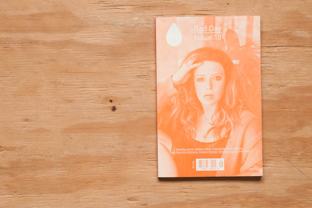
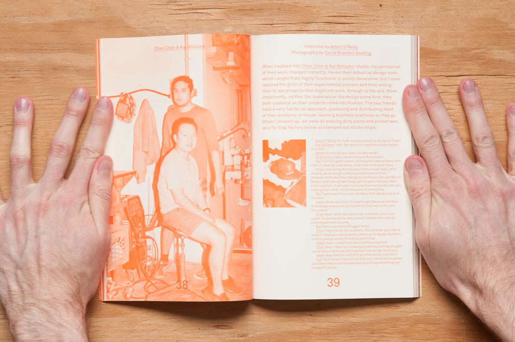
Bad Day is a little hidden gem of a magazine. (Hidden to me anyway, in that I discovered it for the first time about a month ago.) At 6 x 9 inches and printed with one color over a majority of the issue, BD feels less like an arts and fashion magazine distributed world-wide and more like a zine made on someone’s color copier at home. And I mean that in the best possible way. The spot color printing and the small size of the magazine was, for me, what made it stand out amongst the larger full-color magazines that surrounded it on the stand.
That whole zine vibe makes sense too, as that’s how BD first came to be—as a small 50-copy project by Eva Michon and Colin Bergh. That was about seven years ago, and I’m glad that personal, tactile feel hasn’t changed after all this time.
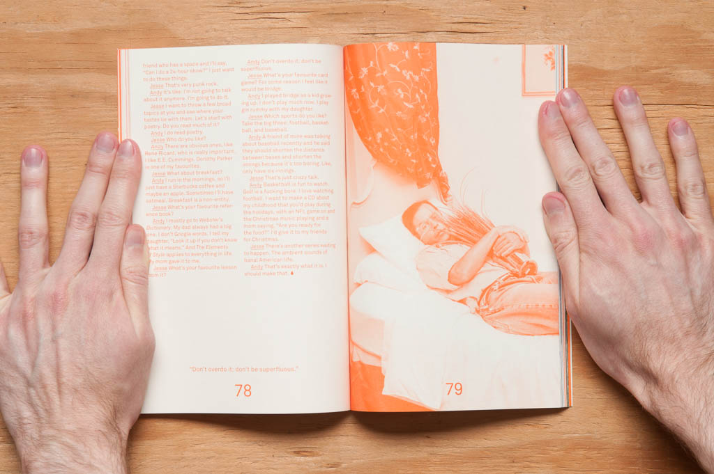
While we’re on the subject of BD’s looks… the design is super simple in that it looks to be completely set in one typeface. The headings, body copy, pull quotes, all of it. Combined with the restriction to one color throughout most of the issue, this is one of the most minimalistic magazine designs I’ve seen. And remember, “minimalist” does not equal “boring”. I love it.
I just have to briefly mention the website here, too. It looks like it was pulled straight from the magazine itself. Color and typeface are just like the mag. It’s some of the most consistent design I’ve seen from digital to print (or vice versa). Bad Day’s got this branding thing down.
Many art-related magazines—well, many magazines period—have interviews as a mainstay of their content, and Bad Day is no different. In fact, that’s the bulk of the issue. But the difference with BD is the quality of the interviews. They don’t feel like “cold calls”. With each interview, either the interviewer had previous knowledge of the interviewee’s field, seemingly fairly extensively, or in some cases the two had met before. In musician Nicholas Krgovich’s interview, his interviewer, Phil Elverum, has spent “much of the last decade collaborating and touring with him”. This made them feel a little less like interviews and a little more like conversations. The breadth of people interviewed was nice to see too: a sculptor and painter; a musician; a jewelry maker; industrial, furniture, and object designers; an advertiser, and an actress (on the cover—Natasha Lyonne).
BD has been referred to as an “edgier, Canadian-er answer to Interview mag.” I, however, would say that BD is kind of on the opposite end of that same spectrum—”anti-edgy”, if you will—in that BD feels more… accessible in a way. I think that’s because, while some of those interviewed could be considered celebrities in their own rights, several of the interviewees were fairly early on in their careers. They could be any of us. That “accessibility feeling”, for me, could also have something to do with the look, production quality, and size of the magazine too, though.
As for “Canadian-er”? My extent of Canadian-related things I’m vaguely aware of is Bob & Doug McKenzie, mounties, and it’s cold up there, so, there you go.
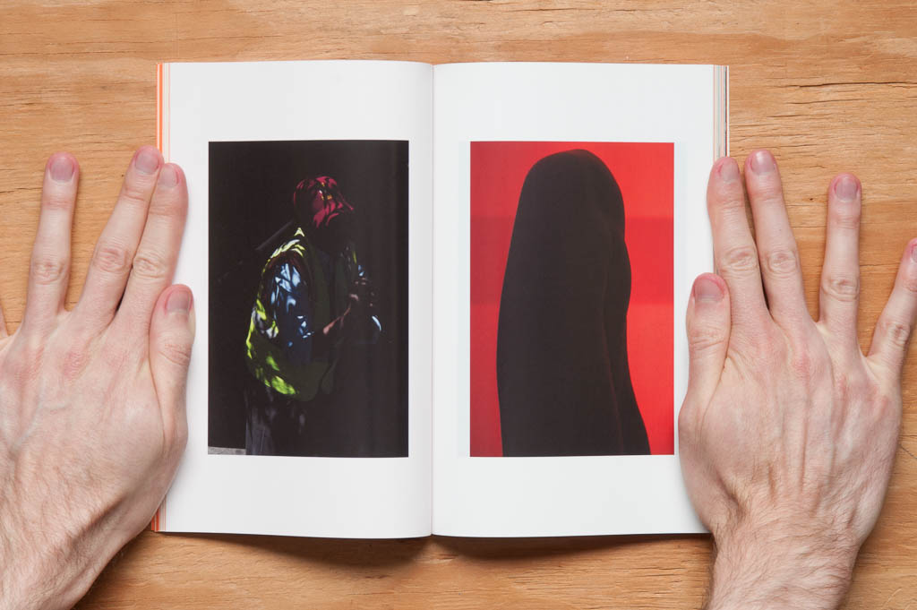
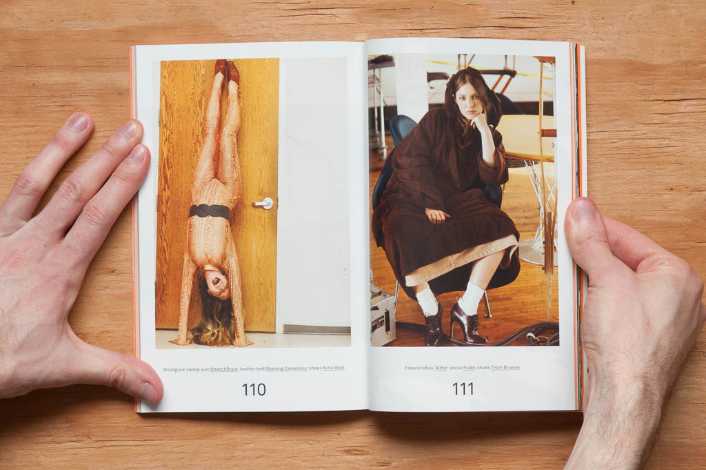
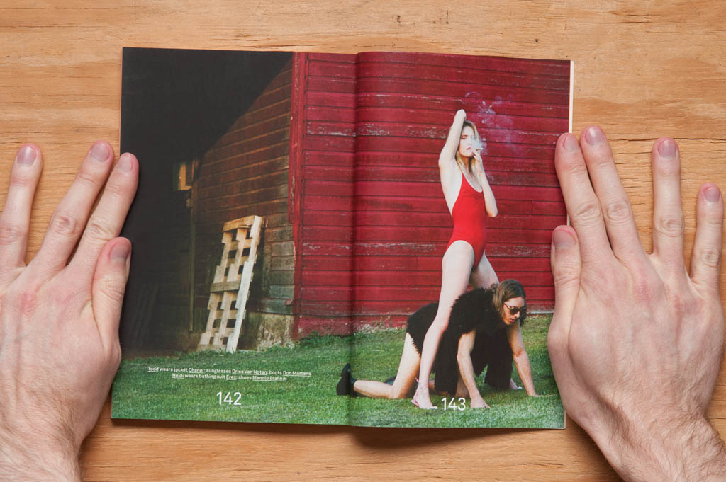
Along with the interviews is a portfolio of art photography by Viviane Sassen and two fashion editorials, all printed on glossy paper (the rest of the mag is a matte stock). I hadn’t known of Sassen before, but my goodness is her work beautiful.
The editorials are great too—fun, sexy, quirky, even a little bizarre at times. Right up my alley.
Now that I’ve told you how wonderful this issue is, I should probably break it to you that this issue is sold out on their website, as are many of the earlier ones. Issue 12 is still there, and I found others from a few online stores after doing a little digging (i.e. the first page of one Google search). If BD’s previous issues are anything like this one though, you’ll dig them.
