Frequency at time of publication: Quarterly Editor-in-Chief: Jason Crombie Publishers: Chris Searl and Campbell Milligan Creative Director: Campbell Milligan Photo Editor: Chris Searl Still published as of this post?: Yes

Picking up this issue of Monster Children was almost an afterthought at the time. I hadn’t bought any new magazines in a while, and I went on a bit of a binge. I flipped through it quickly, saw what at a glance looked to be some good photography and design, and threw it in the pile. Only later when I got it home did I realize what it was all about, and just how good it was.
Monster Children is a magazine with surfing and skateboarding culture at its core. But while that might be the soul of the mag, like a well-rounded individual, the magazine isn’t exclusively about those things. Thrasher this is not (not that there’s anything wrong with that). Even if, like me, surf and skate just isn’t your thing, there’s plenty to enjoy here.
As this is my first issue of MC, I’m assuming the photo annuals are at least subtly different than the regular issues. But be that as it may (or may not), this is all I’ve got to go on, so, there’s that.
So as something billed as a photo annual, the photography needs to be good, right? So how is it?
It’s good.
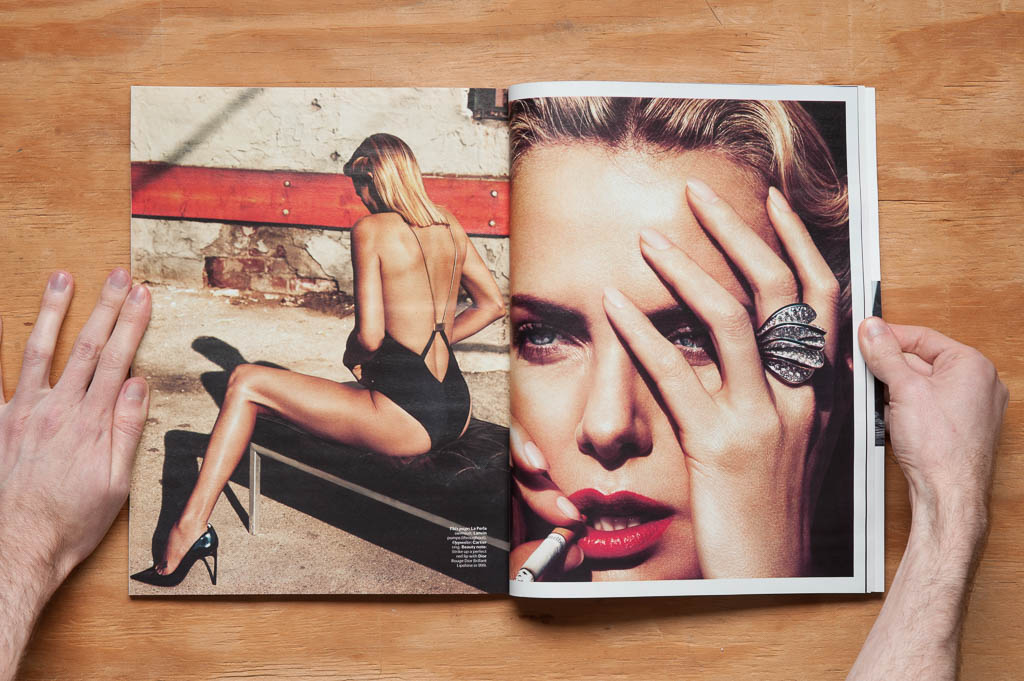
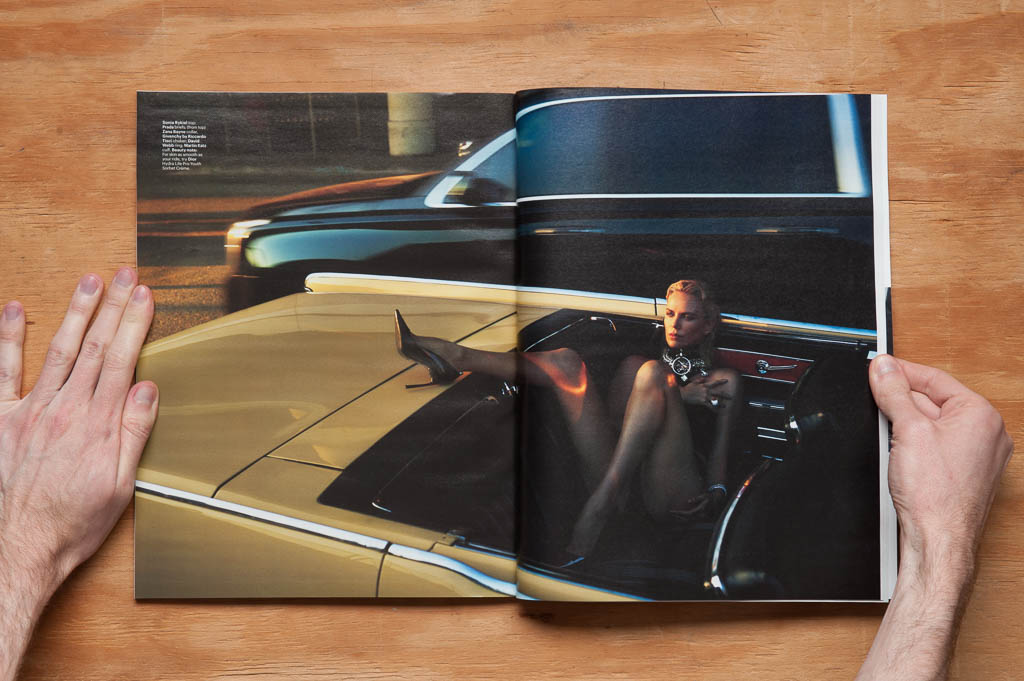
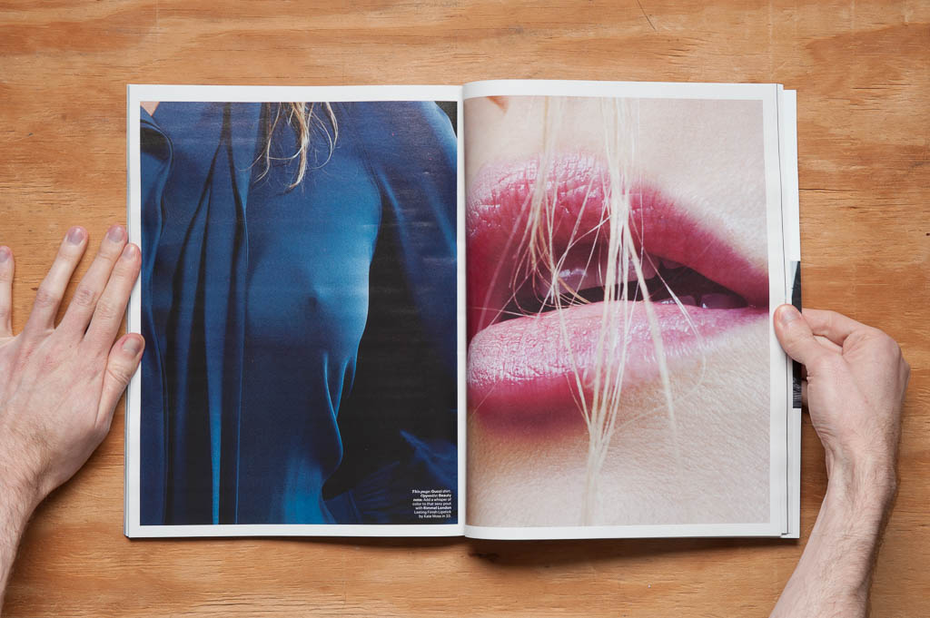
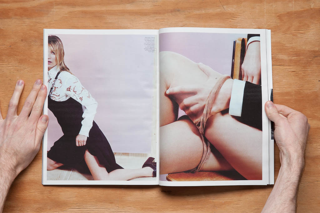
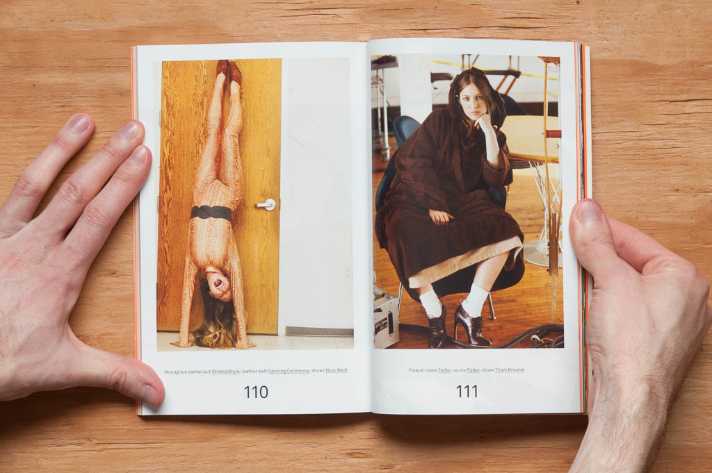
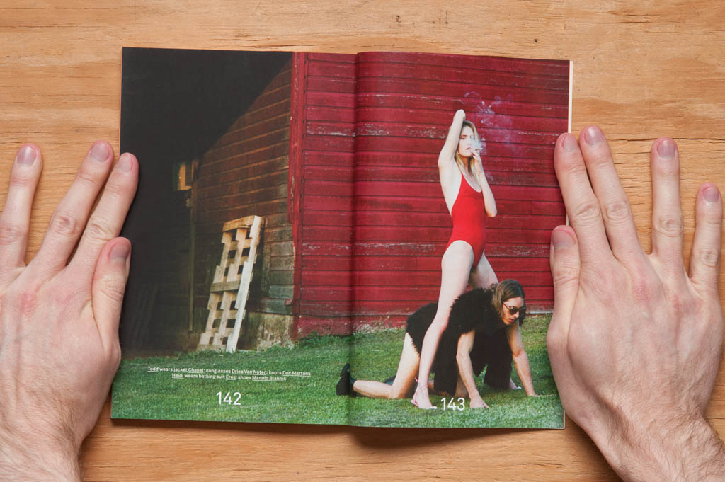
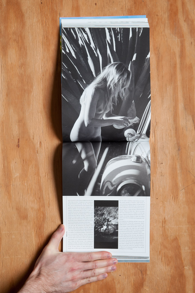
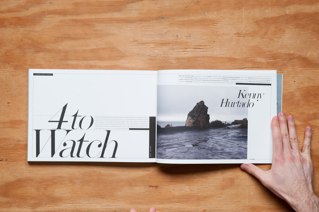
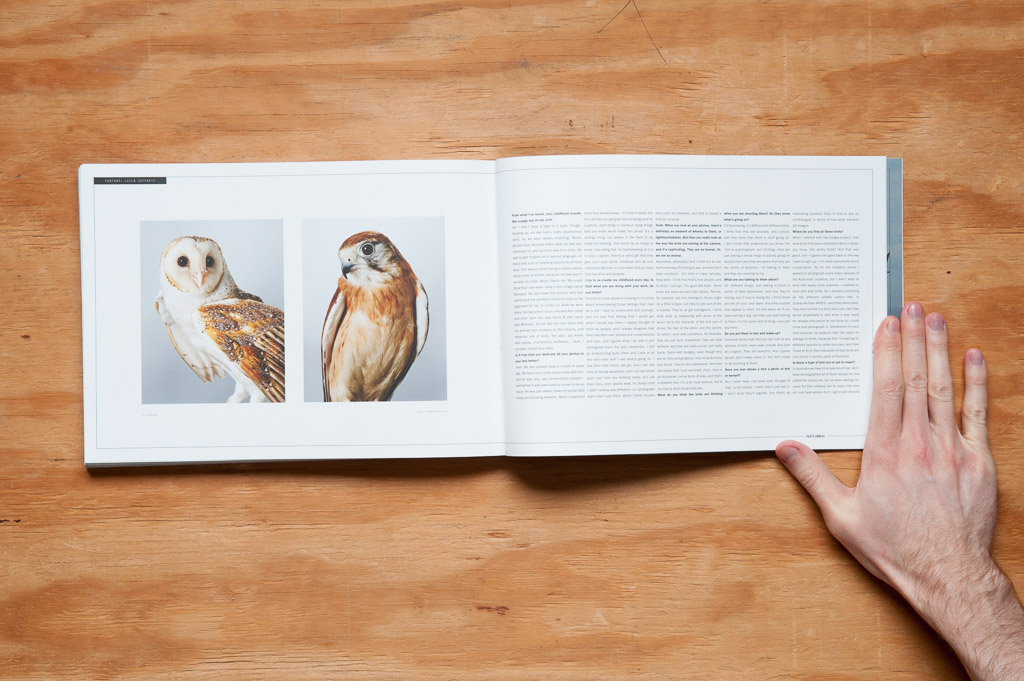
If you want something a little more descriptive… There are several photo features and interviews with photographers. There’s work by students, up-and-comers, and industry pros. It all belongs here, and it’s all beautiful. I’m not going to sit here and describe in painstaking detail how gorgeous this or that picture is; just scroll through and see for yourself.

Really though, they had me sold at “Henrik Purienne”. He just happens to be one of the best photographers working today, and his images for the interview with Jessie Andrews are as good as anything else of his.

The design is pretty damn classy. The headings, with their thick/thin serif typeface, feel like they came from a high-class fashion magazine, but the addition of complementary thick and thin lines throughout pulls it from Just Another Pretty Magazine Land and plants it in the Realm of Fucking Lovely Magazines.

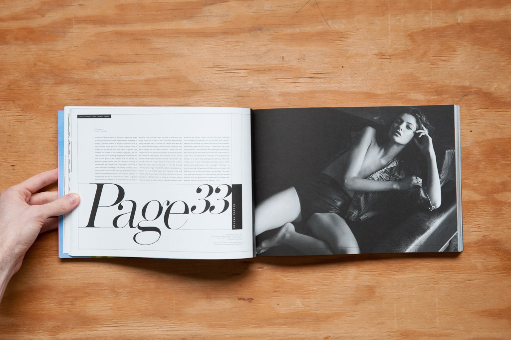
That snarkiness I gathered from/projected onto the design comes through in the editorial, too. 98% of the mag consists of insightful, captivating interviews with plenty of accompanying photos and other things you’ll care about. A few times, though, it felt like the writers were just filling space because, well, they were, but that kind of grew on me after a while. In fact, after I got over my initial annoyance from feeling like I just wasted my time, I realized this was kind of perfect in the department on page 33, aptly titled Page 33.

It’s like a spoof of a pretty girl feature in Maxim, where they have a few eye-candy pictures, and an interview no one cares about to go along with it. Why bother with that when you can write about something that has nothing whatsoever to do with the pretty girl, all the more alluding to the fact that this is pointless, so why don’t you just look at the picture of the pretty girl?
Of course it can be entertaining at times when someone rambles on about something that has nothing to do with anything, just to see how far they’ll go on their tangential word journey. Although, it can be a little annoying when you’ve read a few paragraphs expecting something that, you know, actually has a point, and realize there isn’t one. Unless you manage to buck up and make it to the end and discover there indeed was a point, then one could say it wasn’t really a waste of time after all, and merely a scenic route taken to get to the payoff. But on the other hand, if there truly was no point to the story, your time still wasn’t wasted if you enjoyed yourself along the way, was it?
Right?
I’m not going to prattle on (*ahem*) about each article and feature in the issue—although if you want to read another word wandering, check out the editor’s letter—so here are the highlights:
A list of ten favorite photo zines; interviews with photographers whose subjects run the gamut from landscapes, lifestyle, music, portraits, and fine art; road trip stories; and photos photos photos.

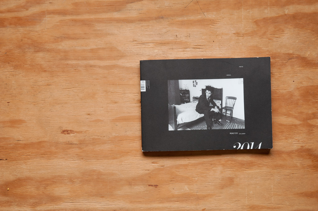
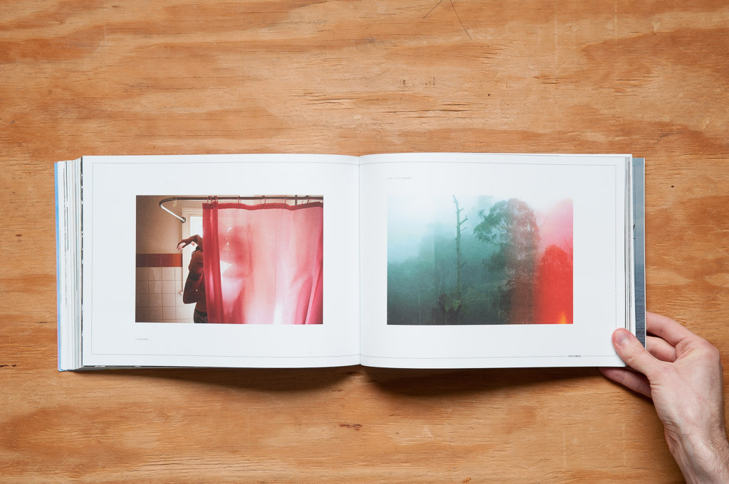
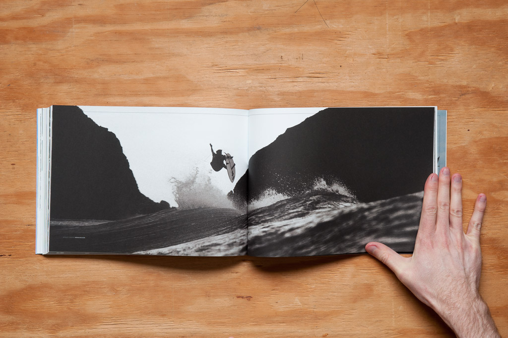
I’d be remiss if I didn’t at least briefly mention the size of the mag, or more accurately, the orientation. At about eleven inches wide by nine inches high, it’s wider than it is tall, and puts it right at the proportions of a photo coming from a 35mm camera (coincidence? I think not!). There are plenty of wide images that take advantage of that orientation, even a few that cover a two-page spread, and the vertical images never feel small in comparison.

Pretty pictures and good design have a way of pulling me into subjects that otherwise hold no interest for me. Compelling, well-written content keeps me reading after you’ve grabbed my attention. All that’s here.
Speaking of rambling, which I wasn’t, although I might have been, I think I’m done now, or not, if I wasn’t.
Or was.
Just buy the damn magazine.
